Introduction
Whilst at university, I had to create a COVID–19 dashboard, which collected data from the UK's National Health Service API, transformed the data, and displayed it as an interactive dashboard.[1] The dashboard functionality was implemented as a Jupyter Notebook, with Violà for displaying the dashboard via the browser, and interactivity via ipywidgets.[2]
Overall, this worked well. It was simple to set–up, all coding could be done in Python rather than Python in addition to front–end languages, and the dashboard has a relatively clean look to it. There were a few challenges, for instance the list of Upper Tier Local Authority names which the API would accept was not clear from the documentation, but these were resolvable.[3]
One problem which has since emerged is that binder will not always load the dashboard, or at least may take some time (five minutes, say) to do so. Additionally, there are some other parts of the layout that I would like to change, such as placing the text side–by–side with the charts, making the charts interactive, and allowing one to show/hide a line by clicking on its name.
Therefore, I decided to turn the Jupyter notebook into it's own standalone web application. I aimed to keep the data processing code in Python, in the hope of salvaging the data processing code and adding the opportunity to add data analytics features (e.g. forecasting) in Python later on. The Flask web framework seemed like a sensible option for building an integrated web application.[4] However, I decided to get some practice with a front–end framework, and therefore to split the application into a separate front–end and back–end.[5] Therefore, I used FastAPI to turn the back–end into an API for a React application.[6]
As there isn't much data to process, I kept the current approach of saving to and loading from JSON and Pickle files rather than building out a database.[7] The data could have been stored in a relational database, such as SQLite, or a document database easily enough.[8]
For charting, I wanted to replace the MatPlotLib and IPyWidgets charts with something more interactive. There are quite a few charting libraries which have nice, interactive charts, including: Apache ECharts[9], D3[10], React–Vis[11], Bizcharts[12], and Vixz.[13] Bizcharts I am avoiding as, whilst the charts gallery has lots of examples, I cannot read most of the documentation and don't currently see a graph style that I want enough to choose Bizcharts over ECharts.[14] React–Vis and Vizx look great, but I preferred some of the versatility of ECharts.
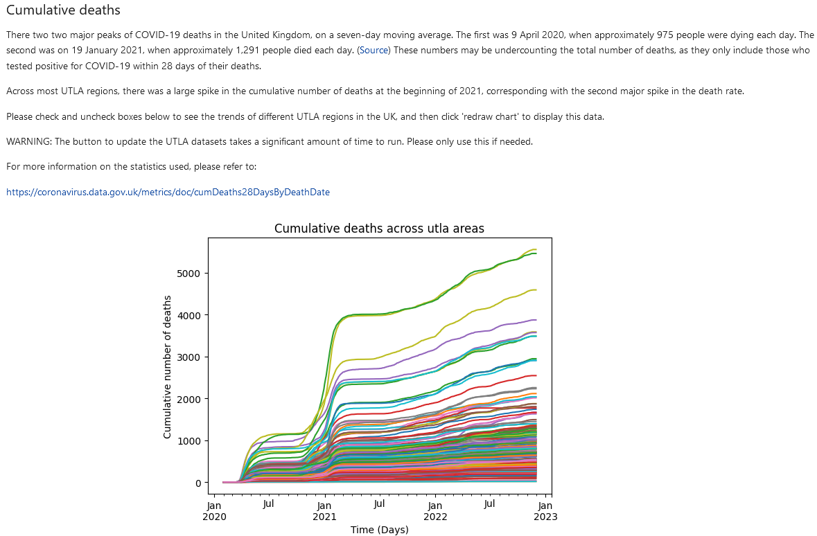
Example from the initial dashboard.
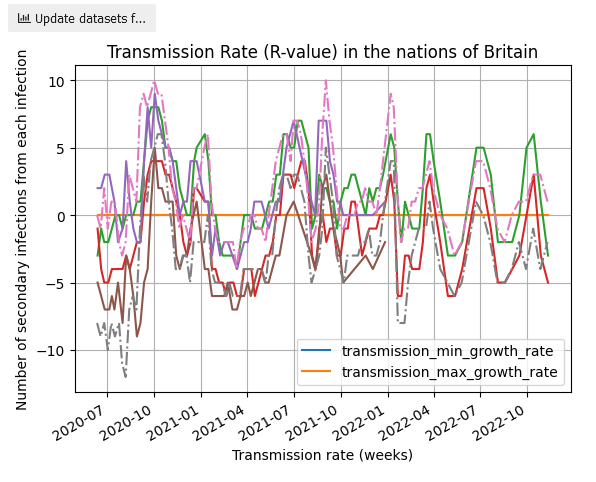
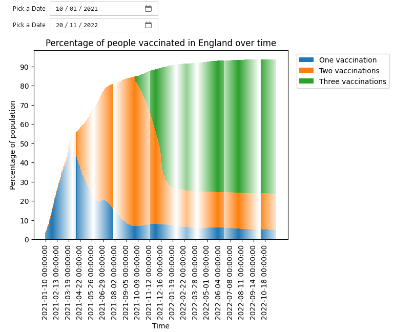
MatPlotLib charts

Less desirable aspects of the initial dashboard.
Step one: Starting From the End
Overall Layout
There are a few different layouts for the dashboard which came to mind. First, is to reproduce the top–down layout of the report as–is from the Jupyter notebook and Violà set up, though perhaps giving it more of a newspaper–style mixture of texts and charts in the same horizontal space.
| Layout | Strengths | Weaknesses |
|---|---|---|
| Newspaper–style, top–down layout | Tells a narrative from the top of the page to the bottom. Provided there is something of immediate value 'above–the–fold',[15] users can be expected to scroll down to view the rest. | Data needs to be laid out in line with user expectations and so that user can quickly move between sections as needed. |
| Have each 'sub report' and chart live within its own tab. | All content in a given tab should (hopefully) be viewable then–and–there, with no need for the viewer to scroll down. Each tab presents a focused set of content. Provided the tab names are clear enough, users should be able to find the content they want easily. | Breaking up the report across tabs forces users to have multiple browser windows open at any given point if one wants to compare data. |
| Use an accordion[16] to allow the user to view and hide different parts of the report as desired. | May alleviate some of the need for readers to jump back–and–forth between different parts of the page. | Assuming that the amount space taken up by the information in each part of the accordion (together with the space taken by the accordion tab) fits into the viewer's screen. |
There are a couple of assumptions underlying in all of these:
- One, that each chart remains distinct, only dealing with one dataset (rate of transmission, vaccination rates, etc...) at a time.
- Two, that the same data is plotted, rather than taking the opportunity to change what data is fetched and plotted.
Breaking the first assumption, having multiple y–axis to compare vaccination rates and death rates in a given UTLA would resolve some of the problems highlighted above: users would not need to jump back–and–forth between multiple charts to compare data, and it would help with telling the story of how the COVID pandemic affected different areas of Britain. However, this does trade–off against clutter: there is a large amount of UTLA data available already, so it should start with data for a single UTLA, make it clear for how users can add additional data series, and make it easy for them to do so.
If this is pursued, then it affects the charting library used. D3 and ECharts support this, but it is quite cumbersome in React–Vis and visx.[17] Creating a vertical, scrollable legend in ECharts can be quite awkward, but is doable. The button designs provided by React–vis are fine, but quite bulky.[18]
Breaking the second assumption would then deal with some of this clutter. If the data plotted is more aggregated, such as vaccination rates and death rates are plotted for each of the nations of Britain rather than each UTLA, then much of the clutter should (hopefully) vanish. This is reliant on the vaccination time series data being a single series for each nation, rather than three separate series.
Of the three, I like the newspaper–approach the most. For now, it will simply reproduce the notebook layout, with a few changes, but it retains the structure needed to tell a story of the pandemic in Britain.
A note on usability testing
At this point, deciding between the different layouts should really have been done by conducting some usability tests and iterating based on their feedback.[19] As this is a small, personal–education project, I have skipped this part.
Data requirements
ECharts requires data to either be provided as lists of data points which can be presented as series:
(code quoted from ECharts)[20]
import * as echarts from 'echarts';

var chartDom = document.getElementById('main');
var myChart = echarts.init(chartDom);
var option;

option = {
  xAxis: {
    type: 'category',
    data: ['Mon', 'Tue', 'Wed', 'Thu', 'Fri', 'Sat', 'Sun']
  },
  yAxis: {
    type: 'value'
  },
  series: [
    {
      data: [150, 230, 224, 218, 135, 147, 260],
      type: 'line'
    },
    {
      data: [100, 30, 24, 18, null, 35, 240],
      type: 'line'
    } // Second series added to code from line–simple chart.
  ]
};

option && myChart.setOption(option);
Or as a dataset, where rows of data are contained in a list:
(code quoted from ECharts)[21]
option = {
  legend: {},
  tooltip: {},
  dataset: {
  //...
    dimensions: ['product', '2015', '2016', '2017'],
    source: [
      { product: 'Matcha Latte', '2015': 43.3, '2016': 85.8, '2017': 93.7 },
      { product: 'Milk Tea', '2015': 83.1, '2016': 73.4, '2017': 55.1 },
      { product: 'Cheese Cocoa', '2015': 86.4, '2016': 65.2, '2017': 82.5 },
      { product: 'Walnut Brownie', '2015': 72.4, '2016': 53.9, '2017': 39.1 }
    ]
  },
  xAxis: { type: 'category' },
  yAxis: {},
  series: [{ type: 'bar' }, { type: 'bar' }, { type: 'bar' }]
};
For the former, each series of data needs to be the same length, to ensure that the x–axis and the series data align correctly. If an element is missing from one of the series, the chart will render, but the data will either be missing an element at the end, or not be aligned correctly. Missing values can be set to 'null', and ECharts will continue to plot the surrounding data points. If there is a data point between two null points, there will need to be some type of marker (for instance, a small circle) which can be used to show that data point on the chart.
I opted for the dataset approach here. As Pandas is already being used, generating rows of data is as simple as calling to_json() with orient='values'.[22] Generating series data requires an additional step to convert the Pandas data frame with to_json() set to orient='column' (which packages the data as {column_name: value}), and then to extract the values out of these lists of objects.
Aside from wrangling the data, the plotting and interactivity can all be completed with JavaScript.
General Flow of Information
The application is split such that the data processing occurs on the back–end, whilst data visualisation and client interaction occurs on the front–end. At a high level, I expected the information to flow through the application in the following manner:
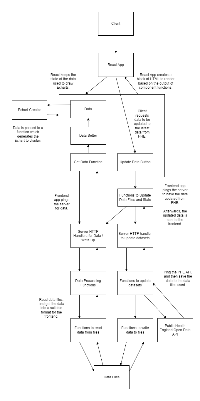
There are two general flows of information: when the user first loads data from the server into the browser, and when the user presses a button to update the datasets. Other interactivity such as engaging with the graphs is all conducted on the user's side.
Write ups for different parts of the dashboard are placed into data files and loaded from the server along with the data. Here, I stored them as HTML to be inserted into the React app.
Step Two: Creating a React front–end
First, in a dashboard folder, I'll create two other folders: a front–end and a back–end.
– dashboard
| – frontend
| – backend
Navigating into the frontend folder, one can use Vite to create a React layout.[23]
npm create vite@latest frontend –– ––template react
For options, I'll select 'React' and plain 'Javascript'. Vite then provides instructions to install the relevant node modules.
I'll create components and services directories to deal with most of the logic of the application.
Components will contain React components used to 'fill in' the page. Here, I want to have rows and columns of information, with text on one side and the interactive chart on the other. There are currently three sections for transmission rates, vaccination rates, and UTLA death data, and each will have its own 'row'. An ECharts generator may also be needed, as there is likely overlap in what options they need. There will also need to be a button to allow users to update data, which can also be shared across the different rows.
Services will contain the functions used to contact the API. I've split these into two: those for simply getting information from the API, and those for sending an update message to the API.
Excluding some of the files created by Vite, this gives a general layout of:
– dashboard
| – frontend
  | – node_modules
  | – public
  | – src
    | – assets
      | – # ...
    | – components
      | – EchartDrawingComponent.jsx
    | – LineChartHelper.jsx
    | – TransmissionTimeSeriesReportBlock.jsx
    | – UpdateDatasetsButton.jsx
    | – UTLACumulativeDeathsReportBlock.jsx
    | – VaccineTimeSeriesReportBlock.jx
    | – services
      | – services.js
    | – updateDatasets.js
    | – App.jsx
    | – main.jsx
    | – # ...
  | – package.json
  | – # ...
| – backend
Creating the ECharts
For producing ECharts, I've opted to use a react component available on Github.[24] Whilst the command line is in the frontend directory, one can run the installation commands on GitHub to install this component.
The transmission and UTLA death line charts can both use the same code, which extracts out the data series and plots all of them onto a single chart.
The general plan of the code here is to:
- first, extract the relevant data from some JSON received from the server,
- second, generate the ECharts options needed to render the chart.
React's useState variable is used here. This will cause the chart to re–render whenever there is a change in the data variables stored in react (see the report blocks below for the declaration).[25] For instance, when one of the update buttons is pressed, after the server has provided new data, the charts will automatically re–render without the user having to reload the page.
import { useEffect } from "react";
import updateData from "../services/updateDatasets"
import ReactEChart from 'echarts–for–react'
// https://github.com/hustcc/echarts–for–react

/*
  Assumes data = {
    column_names: [],
    date_values: [],
    data: {
      series_one: [{}],
      series_two: [{}],
      ...
    }
  }
*/

const EchartCreator = (
  useRefVariable, data, setData,
  getDataFunc, title, xAxisTitle,
  yAxisTitle, vaccineChart, numChartsToDraw,
  stackLines) => {

  // useEffect will get the data from the server
  // whenever the component is rendered.
  // The data, dataSetter, and getDataFunc are passed as
  // parameters to this function to avoid this same
  // code being duplicated in each report block.
  useEffect(
    () => {
      // A 'useRefVariable' is included here
      // to prevent the component from constantly
      // re–rendering.
      if (useRefVariable.current === 0) {
        // Extract the data out
        getDataFunc().then(
          // Call a helper function to extract
          // information from the result and set
          // it to the data (useState) variable.
          res => updateData.ExtractAndSetData(res, setData)
      )
      // Set the useRefVariable to stop the
      // component from constantly reloading
      useRefVariable.current = 1;
      }
    }
  )

  // If it wasn't possible to get the data from the
  // server, provide the user with some feedback on the
  // problem.
  // https://react.dev/learn/conditional–rendering
  if (data === undefined) {
    return (<>
    Sorry I couldn't get this data.
    Please try reloading the page.
    </>)
  }

  // Generate the options needed to raw the Echart,
  // based on the data received from the server.
  // Here, the vaccination data are split across three,
  // vertically stacked charts. Currently, there is no
  // option to have horizontally–stacked charts.
  const dataOptions = lineChartOptionsGenerator(
    title,
    xAxisTitle,
    yAxisTitle,
    data,
    numChartsToDraw,
    stackLines
  )

  // Return an Echart component, which will plot the chart.
  // Note: here I've opted for a chart of a fixed
  // height and width, so that the chart does not become
  // illegible when the browser window is too narrow.
  // These styles can be changed to make the charts much
  // taller and dynamic should one wish.
  return (
    <div>
      <ReactEChart option={dataOptions}
                      style={{
                        height: '500px',
                        width: '500px'
                      }}/>
    </div>
  )
}

const lineChartOptionsGenerator = (
  title, xAxisTitle, yAxisTitle, data) => {
  var option = {
    title: {
      text: title
    },
    // Create a tooltip, so that user's can hover
    // over the chart and see the value of different
    // data points.
    tooltip: {
      trigger: 'axis',
      // Draw horizontal and vertical lines to the point
      // the user's mouse is hovering over.
      axisPointer: {
        type: 'cross',
        label: {
          backgroundColor: '#6a7985'
        }
      }
    },
    // Create a scrollable legend, which is horizontal and
    // listed across the top of the chart.
    legend: {
      type: 'scroll',
      top: 30
    },
    xAxis: [],
    yAxis: [],
    // Let the user zoom into a subset of the x–axis.
    dataZoom: [
      {
        show: true,
        realtime: true,
        start: 0,
        end: 100,
        xAxisIndex: [0, 1]
      },
      {
        type: 'inside',
        realtime: true,
        start: 0,
        end: 100,
        xAxisIndex: [0, 1]
      }
    ],
    dataset: [],
    series: []
  };

  // Add x–axes and y–axes based on the number of charts.
  for (let i = 0; i < numCharts; i++) {
    option.xAxis.push({
      type: 'category',
      name: xAxisTitle,
      data: data.dateValues,
      gridIndex: i
    })

    option.yAxis.push({
      type: 'value',
      // Move the y–axis title from the top of the
      // y–axis to across the middle, and rotate it
      // by 90 degrees.
      nameLocation: 'middle',
      // Only add the title to the middle (or near middle)
      // y–axis.
      name: numCharts % 2 === 0
            ? i === (numCharts / 2)
              ? yAxisTitle
              : ''
            : i === ((numCharts–1) / 2)
              ? yAxisTitle
              : '',
      // Add space between the y–axis title and the
      // numbers on the y–axis
      nameGap: 35,
      gridIndex: i
    })
  }

  // Draw charts
  if (numCharts > 1) {
  // Add a grid to put the charts into.
    option['grid'] = []
    // Assume that 10% of the chart space is taken up with
    // the title and x–axis zoom bar.
    // Take a fraction of the remainder, to position the
    // charts in the remaining spaces.
    const fraction = Math.floor(90 / numCharts)

    for (let i = 0; i < numCharts; i++) {
      option.grid.push({})

      // Don't add a 'top' property to the
      // topmost chart. This allows the top chart to start
      // below the title, rather than oevrlapping with it.
      if (i > 0) {
        option.grid[i].top = (100 – ((numCharts – i) * fraction)).toString() + '%'
      }

      // As above, but for the bottommost chart at the
      // x–axis zoom bar.
      if (i < (numCharts – 1)) {
        option.grid[i].bottom = (100 – ((i+1) * fraction)).toString() + '%'
      }
    }
  }

  /*
  Add datasets for each series included in the JSON sent over
  from the server.
  E.g., the below will add a single dataset:
  {
    ...
    "data": {
      "series_one": [...]
    }
  }

  Whilst this will add two datasets:
  {
    ...
    "data": {
      "series_one": [...],
      "series_two": [...]
    }
  }
  */
  for (const property in data.series) {
    option.dataset.push({
      source: data.series[property]
    })
  }

  /*
  For each column in the data, other than 'date',
  add a line to the chart.

  If there are multiple datasets, then add the lines
  for the relevant dataset.

  If there is only one dataset, with twelve columns of
  data, then twelve line series will be added to the chart
  and all be associated with the same dataset.

  If there are three datasets, each with two columns of data,
  then six series will be added. The first two will be
  associated with the first dataset, the next two the middle
  dataset, and the last two the final dataset.

  Be careful to add lines based on the number of columns
  in the dataset, not the number of rows. The latter will add
  a very large number of lines, which will make the Echart
  very sluggish.
  */
  var datasetToAddTo = –1

  for (const property in data.series) {
    // Start with dataset 0, and count up.
    datasetToAddTo++

    // The [0] here ensures that one only looks at the
    // first row of the series.
      for (const colName in data.series[property][0]) {
      if (colName !== 'date') {
        var lineOpts = {
          name: colName,
          type: 'line',
          datasetIndex: datasetToAddTo
        }

        // Add specific options for stacked line charts.
        if (stackLines) {
          lineOpts['stack'] = property
          lineOpts['areaStyle'] = {}
          lineOpts['xAxisIndex'] = datasetToAddTo,
          lineOpts['yAxisIndex'] = datasetToAddTo
        }

        option.series.push(lineOpts)
      }
    }
  }

  return option;
}

export default EchartCreator
Aside on Styling and Layout
The dashboard is intended to have blocks of text next to charts. This can be achieved by drawing a row and putting two columns into it. Ideally, this is responsive as well, such that when a user narrows the browser window, the text and charts stack on top of each other rather than shrinking in width and becoming hard to read. Bootstrap[26] makes both parts very straightforward, and therefore is used for styling.
Services.js
Services.js uses Axios[27] to ping the server for data. All queries work based on a single send request query, with different url extensions added as needed.
import axios from 'axios'

// The server will run locally on port 8080.
const baseUrl = 'http://localhost:8080/'

// Ask the server for information, extract whatever is in the
// 'data' field from the Axios promise and return it.
// Functions relying on the assumption that the 'data'
// field holds JSON.
const sendRequest = (urlToPing) => {
  return axios.get(urlToPing)
              .then(response => response.data)
}

// Get the JSON from the promise data field, parse it,
// and return it.
const getTransmissionTimeSeries = () => {
  return sendRequest(${baseUrl}transmission–data)
              .then(vts => JSON.parse(vts))
}

const getTransmissionWriteUp = () => {
  return sendRequest(${baseUrl}transmission–write–up)
              .then(vts => JSON.parse(vts))
}

const updateTransmissionDataset = () => {
  return sendRequest(${baseUrl}update–transmission–datasets)
              .then(res => console.log(res))
}

// ...

export default {
  getTransmissionTimeSeries: getTransmissionTimeSeries,
  getTransmissionWriteUp: getTransmissionWriteUp,
  updateTransmissionDataset: updateTransmissionDataset,
  // ...
}
updateDatasets.js
This file provides some wrapper functions for asking the server to contact PHE for new data, and then to have React ask for the updated data.
The ExtractAndSetData function assumes all coming in from the server has the same format. It draws this data out and uses whatever setter function it was given to update the data held by React.
/*
  Assumes data = {
    column_names: [],
    date_values: [],
    data: {
      series_one: [{}],
      series_two: [{}],
      ...
    }
  }
*/
Async–await is used here to force React to wait until the server has finished updating the data it received from PHE before asking the server for new information. If React does not wait, it will (asynchronously) send off the request to have the server update its datasets, and then (also asynchronously) ask the server for new information. To avoid the server from being banned by the PHE API, it will have to pause for some amount of time (e.g. a second). This pause is long enough for React to hear the server simply give it the data it already had, rather than any new data from PHE. At best, the user will assume that the data one already has is the latest available. At worst, the suer will repeatedly click the update button, sending unnecessary requests to the server and PHE.
import services from "./services"

/*
  Assumes data from the server comes in the following format:
  {
    dateValues: [...],
    data: {
      series_one: [...],
      series_two: [...],
      ...
    }: JSON data type
  }
*/
const ExtractAndSetData = (dt, setterFunc) => {
  const temp = {
      dateValues: dt.date_values,
      series: {}
    }
    for (const property in dt.data) {
      temp.series[property] = JSON.parse(dt.data[property])
    }
    setterFunc(temp)
}

const UpdateTransmissionDatasets = async (setTransmissionData) => {
  // Wait for data to be updated on the server–side.
  await services.updateTransmissionDataset()
  // Once done, fetch the data.
  services.getTransmissionTimeSeries().then(tr => {
      updateHelper(tr, setTransmissionData)
  })
}

// ...

export default {
  UpdateTransmissionDatasets: UpdateTransmissionDatasets,
  // ...
}
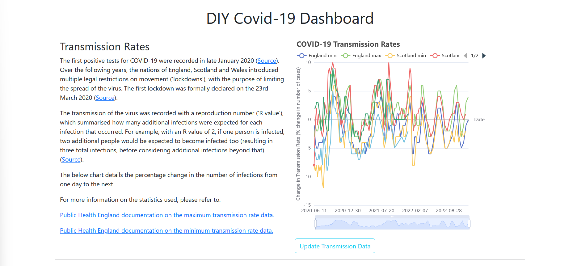
Transmission Report Block
The TransmissionTimeSeriesReportBlock.jsx component manages it's own variables for report text and data, as well as arranging them.
import { useState, useEffect, useRef } from 'react'
import EchartCreator from './lineEchartHelper'
import services from '../services/services'
import UpdateDatasetsButton from './UpdateDatasetsButton'
import UpdateDatasets from '../services/updateDatasets'

const TransmissionTimeSeriesChartReportBlock = () => {
  // Upon setting these variables to contain new data,
  // the echarts reliant on them will be re-rendered by
  // react.
  const [transmissionData, setTransmissionData] = useState({
    dateValues: [],
    data: []
  });

  const [htmlWriteUp, setHtmlWriteUp] = useState("")
  useEffect(() => {
    services.getTransmissionWriteUp()
            .then(res => setHtmlWriteUp(res))
  })

  const s = useRef(0);

  return (
    <>
      <div class="container text–start">
        <div class="row">

          <div class="col">
            // NOTE: dangerouslySetInnerHTML is only used here
            // as this is a locally–run web app, where one can
            // be sure no cross–site scripting attack is occurring.
            // See the documentation for security concerns:
            // https://react.dev/reference/react–dom/components/common#dangerously–setting–the–inner–html
            <div dangerouslySetInnerHTML={{__html: htmlWriteUp}} />
          </div>

          <div class="col">
          // Create the Echart with the menagerie of
          // parameters it asks for.
            {EchartCreator(
              s,
              transmissionData,
              setTransmissionData,
              services.getTransmissionTimeSeries,
              'COVID–19 Transmission Rates',
              'Date',
              'Change in Transmission Rate (% change in number of cases)',
              1,
              false
            )}

            // Draw the update button
            {UpdateDatasetsButton(
              "",
              UpdateDatasets.UpdateTransmissionDatasets,
              setTransmissionData,
              "Update Transmission Data",
              "btn btn–outline–info"
            )}
          </div>

        </div>
      </div>
    </>
  )
}

export default TransmissionTimeSeriesChartReportBlock
Both the vaccination block and UTLA cumulative deaths blocks use the same layout and logic. There only differences are in the data and parameters used to generate ECharts, and whether the chart is on the left– or right–hand side of the page.
App.jsx
App.jsx simply draws all of the above together. It imports the relevant components and the Bootstrap styling and adds some horizontal line rules to add a little distinction between different parts of the page.
import './App.css'
import VaccinationTimeSeriesChartReportBlock from './components/VaccineTimeSeriesReportBlock'
import TransmissionTimeSeriesChartReportBlock from './components/TransmissionTimeSeriesReportBlock'
import UTLACumulativeDeathsTimeSeriesChartReportBlock from './components/UTLACumulativeDeathsReportBlock'

function App() {
  return (
    <div>

      <link href="https://cdn.jsdelivr.net/npm/bootstrap@5.3.2/dist/css/bootstrap.min.css" rel="stylesheet" integrity="sha384–T3c6CoIi6uLrA9TneNEoa7RxnatzjcDSCmG1MXxSR1GAsXEV/Dwwykc2MPK8M2HN" crossOrigin="anonymous"></link>

      <h1>
        DIY Covid–19 Dashboard
      </h1>

      <div className='grid gap–3'>

      <hr />

      // Note that this could also have been:
      // {TransmissionTimeSeriesChartReportBlock()}
      <TransmissionTimeSeriesChartReportBlock() />

      <hr />

      <VaccinationTimeSeriesChartReportBlock() />

      <hr />

      <UTLACumulativeDeathsTimeSeriesChartReportBlock() />

      </div>

      <script src="https://cdn.jsdelivr.net/npm/bootstrap@5.3.2/dist/js/bootstrap.bundle.min.js" integrity="sha384–C6RzsynM9kWDrMNeT87bh95OGNyZPhcTNXj1NW7RuBCsyN/o0jlpcV8Qyq46cDfL" crossOrigin="anonymous"></script>

    </div>
  )
}

export default App
Step Three: Extracting Code from the Jupyter Notebook into to a FastAPI Server
Arranging the code into Python modules.
The data loading and processing code can be spread out across modules, which will help with testing later on.[28] There are four main parts to the back–end:
- Code which interacts with data files,
- Code which contacts the PHE API,
- Code to process the data into the correct format,
- HTTP handlers for the front–end to contact.
main.py file at the root of the backend directory. All other sections will live in sub directories, and need __init__.py files to make their code available to other packages.[29] This resulted in the following directory layout:
– dashboard
| – frontend
| – backend
  | – __init__.py
  | – main.py
  | – phe_api_caller
    | – __init__.py
    | – phe_api_caller.py
    | – test_phe_api_caller.py
    | – phe_api_helper.py
    | – test_phe_api_helper.py
  | – data
    | – __init__.py
    | – load_and_save_files.py
    | – data_file_names.py
    | – england_vaccination_rates.json
    | – ...
    | – transmission_report_write_up.html
    | – ...
  | – data_processing
    | – __init__.py
    | – data_processing.py
    | – test_data_processing.py
The __init__.py file at the root imports all modules.
from .phe_api_caller import *
from .data_processing import *
from .data_files import *
The __init__.py file in each package then imports the relevant functions and variables from across the package, to make available to the rest of the application.
from .phe_api_caller import query_public_health_england_API_for_data
from .phe_api_caller import query_PHE_and_save_to_JSON
from .phe_api_helper import *
HTTP Handlers
There are nine HTTP handlers: one for each of getting data for the charts, the write–ups, and to replace the current data with the latest from Public Health England. As the front–end framework will be running on a different port, CORS further needs to be enabled to allow the front–end to read the JSON data it receives.
Note that as this is meant to be a dashboard run locally, no security measures are in place. If deployed for public use, it may be best to limit the number of times a given user can press the update button, or simply to return an 'All data is up to date' message if the files have been updated in the last twenty–four hours.
import data_processing.data_processing as dp
import data_files.load_from_files as lff
import phe_api_caller.phe_api_caller as pac
from json import dumps as json_dumps
from fastapi import FastAPI
from fastapi.middleware.cors import CORSMiddleware

app = FastAPI()

# State where requests for data can come from.
origins = [
  "http://localhost:5173"
]

# Set–up CORS middleware
app.add_middleware(
  CORSMiddleware,
  allow_origins=origins,
  allow_credentials=True,
  allow_methods=["*"],
  allow_headers=["*"],
)

# Get data and send it back as JSON.
@app.get("/transmission–data")
def get_transmission_chart_data_from_json_files():
  return json_dumps(dp.get_transmission_data())

@app.get("/transmission–write–up")
def get_transmission_write_up_html():
  return json_dumps(
    lff.get_html_from_file(
      './data_files/transmission_write_up.html'
    )
  )

@app.get("/update–transmission–datasets")
def update_transmission_datasets():
  res = pac.update_PHE_transmission_datasets()
  # Return a message to inform the client–side
  # on success or failure.
  if res:
      return json_dumps("Update succeeded!")
  else:
      return json_dumps("Update failed!")

# ...
Data Processing
All of the heavy lifting to get the PHE data into shape is done by data_processing.py. In general, data is processed in a standardised fashion of:
- load the data into Pandas data frames,
- complete any relevant processing,
- store the data in the nested–JSON format needed by the front–end.
As Datasets are used on the front–end, Pandas' to_json() function will use orient='records'.[30] For the UTLA data:
[
  {
    "date":"2020–02–01",
    "Richmond upon Thames":0.0,
    "Trafford":0.0,
    "Kirklees":0.0,
    "Gloucestershire":0.0,
    "Greenwich":0.0,
    "County Durham":0.0,
    "Haringey":0.0,
    "North Lanarkshire":0.0,
    "Kingston upon Thames":0.0,
    ...
  }
]
Getting UTLA data is the simplest here:
def get_json_utla_cumulative_death_data() –> Dict:
  # Load the UTLA data from the pickle file.
  utla_df = lff.load_dataframe_from_pickle(
    df.path_to_data_files + df.utla_pickle_file_name
  )

  # The pickle file uses 'date' as the index.
  # To send 'date' values in JSON, they
  # can be extracted from the index into their
  # own column. These are made the rightmost column
  # by default.
  utla_df['date'] = utla_df.index.astype('str')

  # After extracting the date values, rearrange the columns
  # so that 'date' is the leftmost column. This
  # ensures that, when the data frame is serialised to JSON
  # as 'records' (see below) it has the format:
  # {'date': '2020–10–01', 'county': value}
  # See [31]
  utla_df = utla_df[utla_df.columns.to_list()[–1:] \
          + utla_df.columns.to_list()[:–1]]

  data_to_return = {
    # Extract the date values
    "date_values": utla_df['date'].to_list(),
    "data": {
    # Convert the data frame to JSON.
      "series": utla_df.to_json(orient='records')
      }
  }

  return data_to_return
Getting the transmission data is a little more involved.
At the high level, the steps are nearly the same:
def get_transmission_data() –> Dict:
  # Load the data as data frames.
  # NOTE: the program will look for the file starting
  # from the directory where the program is started
  # (here, 'backend'). Therefore, the path
  # from 'backend' to the data files is provided
  # as well, even though the Python script to read the data
  # files is in the same directory as the data files.
  england_data: pd.DataFrame = get_transmission_data_and_ffill(
          './data_files/', 'England'
  )
  scotland_data: pd.DataFrame = get_transmission_data_and_ffill(
          './data_files/', 'Scotland'
  )
  wales_data: pd.DataFrame = get_transmission_data_and_ffill(
          './data_files/', 'Wales'
  )
  # Get a complete series of date values between the earliest
  # and latest dates in the data frames (see below).
  date_values = create_pandas_time_series_for_earliest_to_latest_dates(
      [
          england_data,
          scotland_data,
          wales_data
      ],
      'date'
  )

  england_data['date'] = england_data['date'].astype(str)
  scotland_data['date'] = scotland_data['date'].astype(str)
  wales_data['date'] = wales_data['date'].astype(str)

  # Prepare the data for the front–end.
  data_to_return = {
    "date_values": date_values,
    "data": {
      "england": england_data.to_json(orient='records'),
      "scotland": scotland_data.to_json(orient='records'),
      "wales": wales_data.to_json(orient='records')
    }
  }

  return data_to_return
Whilst it is possible to plot the data as–is, there are a number of breaks in the data when doing so. For example, whilst PHE provides transmission data for approximately the same time periods across all three nations, the values are not always reported on the same days. I've made a few assumptions to string these together for the 'at a glance' view of the chart:– If only one of the minimum or maximum transmission rate is known, then the missing value can be replaced with the other value. Pandas makes this straightforward.[32]
For an overview, this seems acceptable. For analysis, this is an odd assumption (for example, one might expect that there is a particular trend in the minimum or maximum transmission rates from day–to–day, and thus should model the missing value based on that).– If neither transmission rate value is known, use the last–known value. This is harder to justify, as it should be plotted as a missing value on the chart. I've included this here as, at a glance, many of the points are hard to see, and therefore the trend in the chart hard to discern. Setting the unknown values to zero shows the trend, but gives the impression that the transmission rates have dropped to zero when they are quite far from it.
The consequences of bad assumptions: not using all dates; setting missing values to zero, and filling in data past the last reported point.
There are a few other options available. On the front–end, the lines could be matched up with ECharts' connectNulls option.[33] Otherwise, on the back–end, there are a few other types of data imputation which are recommended online, but they have their own issues and it isn't obvious that these are necessarily better given the purpose of this dashboard.[34]
To implement these steps, one needs to create the full list of date values:
def create_pandas_time_series_for_earliest_to_latest_dates(
  list_of_data_frames: List,
  name_of_date_col: str) –> List:

  earliest_date = min(
    [x[name_of_date_col].min() for x in list_of_data_frames]
  )

  latest_date = max(
    [x[name_of_date_col].max() for x in list_of_data_frames]
  )

  return pd.date_range(
    start=earliest_date,
    end=latest_date
  ).astype(str).to_list()
As well as filling in the NA values:
def get_transmission_data_and_ffill(path_to_file, country_name):
  # Load the data as a Pandas' data frame
  transmission_df: pd.DataFrame = convert_date_col_to_datetime(
    lff.load_JSON_file_as_pd_dataframe(
      f'{path_to_file}{df.transmission_data_files[country_name]}'
    )
  )

  # Rename it to something easier to read.
  col_rename_mapper: Dict = {
    'transmission_min_growth_rate': country_name + ' min',
    'transmission_max_growth_rate': country_name + ' max'
  }

  transmission_df.rename(
    mapper=col_rename_mapper,
    axis='columns',
    inplace=True
  )

  # Sort values chronologically.
  transmission_df.sort_values(
    by=['date'],
    ascending=True,
    inplace=True
  )

  # Replace missing minimum transmission values with the
  # maximum if known.
  transmission_df[country_name + ' min'].fillna(
    value=transmission_df[country_name +' max'],
    inplace=True
  )

  # Vice versa
  transmission_df[country_name + ' max'].fillna(
    value=transmission_df[country_name + ' min'],
    inplace=True
  )

  # Replace the remainder with the last known
  # transmission value.
  transmission_df.ffill(inplace=True)

  return transmission_df
Getting vaccination data follows similar steps to getting transmission data. The one exception is the need to remove double–counting. I assume that PHE has accounted for changes in population which affect these statistics (due to people who had vaccinations passing away from any cause, and due to more children turning twelve, and thus being included in the population statistics). Therefore, for the data provided, if there are missing values I assume that the last known value can be used.
For example, the vaccination data for Scotland contains the following:
| Date | First | Second | Third |
|---|---|---|---|
| 2022–09–03 | 95.1 | 89.6 | 75.1 |
| 2022–09–04 | 95.1 | 89.6 | 75.2 |
| 2022–09–05 | 95.1 | 89.6 | null |
| Date | First | Second | Third |
|---|---|---|---|
| 2022–09–03 | 95.1 | 89.6 | 75.1 |
| 2022–09–04 | 95.1 | 89.6 | 75.2 |
| 2022–09–05 | 95.1 | 89.6 | 75.2 |
def remove_double_counting_for_vaccination_figures(vac_data_frame):
  # 'f', 's', and 't' are
  # shorthand for the 'first', 'second', and 'third'
  # vaccination figures respectively.
  vac_data_frame[vps['f']] = vac_data_frame[vps['f']]\
      .sub(vac_data_frame[vps['s']], fill_value=0)
  vac_data_frame[vps['s']] = vac_data_frame[vps['s']]\
      .sub(vac_data_frame[vps['t']], fill_value=0)

  return vac_data_frame
As with transmission data, a series of date values from the earliest date to the latest are included here. The vaccination datasets differ more than the others, however, with the Scotland data ending in September 2022, Wales in March 2023, and England in December 2023 at the time of writing. It is possible to plot each one with its own time series, but this can introduce a visual 'trick', where users overlook the differing x–axes. A viewer may then assume that Scotland had a comparatively slow uptake of vaccinations, when that isn't necessarily the case. Therefore, all three charts should use the same series of dates.
Data Files
Pandas makes loading JSON data into a data frame straightforward. The data provided by PHE is in the format:
{
  "data": [
    {
      "date": "2022–12–23",
      "transmission_min_growth_rate": 0.0,
      "transmission_max_growth_rate": 4.0
    },
    ...
  ]
}
Which can be saved with:
import typing
#...

def save_dictionary_data_to_JSON_file(
    dictionary_to_save: typing.Dict,
    file_name_with_json_extension: str
) –> ():

  with open(file_name_with_json_extension, "wt") as OUTF:
      json.dump(dictionary_to_save, OUTF)
Then, it can be loaded with:
# Read in the JSON data.
def read_JSON_file(
  file_name_with_json_extension: str
  ) –> str:

  with open(file_name_with_json_extension, "rt") as INFILE:
    variable_to_return = json.load(INFILE)

  return variable_to_return

# Convert the JSON data into a Pandas data frame.
def load_JSON_file_as_pd_dataframe(
  file_name_with_json_extension: str
  ) –> pd.DataFrame:

  return pd.DataFrame.from_dict(
    read_JSON_file(
      file_name_with_json_extension
    )['data']
  )
The report write ups (with HTML) are also loaded in nearly the same way, simply replacing the json.load() with file.load().
Pickle files are also straightforward (though see the api section for UTLA–specific code where more wrangling is needed).
def save_dataframe_to_pickle(
  dataframe_to_save: pd.DataFrame,
  name_of_file_to_save_with_file_extension: str
  ) –> ():

  dataframe_to_save.to_pickle(
    name_of_file_to_save_with_file_extension
  )

def load_dataframe_from_pickle(
  file_name_with_extension: str
  ) –> pd.DataFrame:

  return pd.read_pickle(file_name_with_extension)
The data_file_names.py file provides lists of dictionaries and variables used by other files. Should any value need to be updated, it can be updated from here.
path_to_data_files = './data_files/'

vaccination_data_files = {
  'England': 'england_vaccination_percentages.json',
  'Scotland': 'scotland_vaccination_percentages.json',
  'Wales': 'wales_vaccination_percentages.json'
}

vaccination_percentage_list_shorthands = {
  'f': 'percentage_first_vaccinations',
  's': 'percentage_second_vaccinations',
  't': 'percentage_third_vaccinations'
}

transmission_data_files = {
  'England': 'england_transmission_rates.json',
  'Scotland': 'scotland_transmission_rates.json',
  'Wales': 'wales_transmission_rates.json'
}

utla_pickle_file_name = 'ulta_deaths_pickle.pkl'
API caller
PHE requires that filters and a structure be provided in order to provide data. For convenience, these are stored in the phe_api_helper file. The format needed is supplied in the PHE documentation.[35]
filter_region_nation_england = [
  "areaType=nation",
  "areaName=England"
]

# ...

structure_for_transmission_rates = {
  "date": "date",
  "transmission_min_growth_rate": "transmissionRateGrowthRateMin",
  "transmission_max_growth_rate": "transmissionRateGrowthRateMax",
}

# ...

utla_region_list = [
    "Aberdeen City",
    "Aberdeenshire",
    "Angus",
    # ...
  ]
The core function for calling the API simply takes the filters and structure it needs, and then asks for data.
def query_public_health_england_API_for_data(
    filters_to_query_with,
    structure_to_query_with
  ):
  # Sleep for one second, to avoid sending too
  # many requests too quickly.
  time.sleep(1)

  # Set up the api
  api = Cov19API(
    filters=filters_to_query_with,
    structure=structure_to_query_with
  )

  # Call the api
  data_from_api = api.get_json()

  return data_from_api
Another function can wrap around this to save the data from the API to JSON.
def query_PHE_and_save_to_JSON(
  filters_to_query_with,
  structure_to_query_with,
  file_name_with_json_extension
  ):

  data_from_api = query_public_health_england_API_for_data(
    filters_to_query_with,
    structure_to_query_with
  )

  lff.save_dictionary_data_to_JSON_file(
    data_from_api,
    './data_files/' + file_name_with_json_extension
  )

  return data_from_api
As each of the transmission and vaccination datasets require separate calls to the API, and ideally will be stored in separate files, one can provide the filters and names of the files to save to in a loop.
def update_PHE_vaccination_datasets() –> bool:
  print("updating vaccination datasets")
  vaccination_rate_file_name_to_filters = {
    "england_vaccination_percentages.json": pah.filter_region_nation_england,
    "wales_vaccination_percentages.json": pah.filter_region_nation_wales,
    "scotland_vaccination_percentages.json": pah.filter_region_nation_scotland
  }

  # Provide the relevant filters and structures to a helper function,
  # which calls the above functions.
  return update_dataset_helper(
    vaccination_rate_file_name_to_filters,
    pah.vaccination_percentages_structure
  )

# ...

def update_dataset_helper(
    dict_of_file_name_to_filters,
    structure_for_phe
  ) –> bool:

  # Only get the file names (keys), to avoid a
  # 'ValueError: Too many values to unpack'
  for file_name in dict_of_file_name_to_filters:
    try:
      query_PHE_and_save_to_JSON(
        dict_of_file_name_to_filters[file_name],
        structure_for_phe,
        file_name,
      )
      print(f"saved {file_name}")

  # If there is an error, print to the console for
  # debugging purposes.
    except BaseException as e:
      print(e)
      return False

  return True
With the UTLA data, this simplicity goes out of the window. To avoid having to redownload all UTLA files if API stopped responding, I saved each individual set of UTLA data in its own JSON file. PHE may return empty JSON if the query succeeds, but it has no data for the area. Each takes the form:
{
  "data": [
    {
      "date": "2022–06–01",
      "area_name": "Aberdeen City",
      "cumulative_deaths_28_days": 348
    },
    {
      "date": "2022–05–31",
      "area_name": "Aberdeen City",
      "cumulative_deaths_28_days": 348
    },
    ...
  ]
}
The high–level function then stores the UTLA data into files, then opens them to load the data into a data frame, and then saves them as a pickle. This is one of the most obvious places where the program can be improved.
def update_utla_death_data() –> bool:
  res = fetch_updated_utla_death_rate_data_from_PHE()
  if not res:
      return False

  utla_deaths_df_updated_with_json = (
      lff.load_data_from_utla_files_and_store_in_pandas_dataframe()
  )

  utla_deaths_df_nans_removed = remove_nan_values_from_ulta_death_frame(
      utla_deaths_df_updated_with_json
  )

  lff.save_dataframe_to_pickle(
    utla_deaths_df_nans_removed,
    "ulta_deaths_pickle.pkl"
  )

  return True
Fetching UTLA data from the API is nearly the same as the above, with the exception that the area names are created when needed.
def fetch_updated_utla_death_rate_data_from_PHE() –> bool:
  utla_regions =  pah.get_utla_region_list()

  for utla_region in utla_regions:
    # Wait for a period of 1 to 5 seconds between queries,
    # to avoid overloading PHE whilst conducting over 200 queries.
    time.sleep(randint(1, 5))

    try:
      query_PHE_and_save_to_JSON(
        # Construct the filter on–the–fly.
        ["areaType=utla", "areaName=" + utla_region],
        pah.structure_for_utla_death_rates,
        "utla_" + str(utla_region).lower() + "_death_rates.json",
      )

    except BaseException as e:
      print(e)
      return False

  return True
Loading the UTLA JSON files to get the data out again is closer to a saga.
from phe_api_caller.phe_api_helper import utla_region_list

# ...

def load_data_from_utla_files_and_store_in_pandas_dataframe():
  # First, get a list of dates from the start of the dataset
  # (a date which is hard–coded here) until today.
  # This will be the basis for the data frame.
    list_of_pandas_dates_for_utla_deaths = create_pandas_date_index_for_utla_data()

  # Create the layout of the data frame, which will be filled in below.
  utla_deaths_df_to_return = pd.DataFrame(
    columns = list_of_utla_names,
    index = list_of_pandas_dates_for_utla_deaths
  )

  # Get the list of files in this directory.
  list_of_files_in_directory = os_listdir()

  # If a file name starts with 'utla',
  # then load its contents as JSON.
  for file_name in list_of_files_in_directory:
    if file_name[0:4] == "utla":
      with open(file_name, "rt") as INFILE:
        utla_file_data = json.load(INFILE)

        try:
          current_utla_area_name = utla_file_data["data"][0]["area_name"]

          # Fill in the utla cumulative deaths dataframe
          for entry in utla_file_data["data"]:
            date = convert_to_pandas_datetime(entry["date"])

            if pd.isna(
              utla_deaths_df_to_return.loc[
                date,
                current_utla_area_name
              ]
            ):

            # Assume that any instances of None are from
            # the start of the series (i.e. before any
            # deaths were recorded in this UTLA).
            value = (
                float(entry["cumulative_deaths_28_days"])
                if entry["cumulative_deaths_28_days"] != None
                else 0
            )
            # Insert value into data frame.
            utla_deaths_df_to_return.loc[
                date,
                current_utla_area_name
            ] = value

        except:
          # If there is an issue, simply plough on.
          continue

  return utla_deaths_df_to_return

def create_pandas_date_index_for_utla_data() –> typing.List:

  list_of_pandas_dates_for_utla_deaths = (
    generate_pandas_dataframe_with_start_date_and_end_date(
      start_date=pd.to_datetime("2020–02–01", format="%Y–%m–%d"),
      end_date=pd.to_datetime("today").normalize(),
      frequency_to_generate="D",
    )
  )

  return list_of_pandas_dates_for_utla_deaths

def generate_pandas_dataframe_with_start_date_and_end_date(
    start_date: str,
    end_date: str,
    frequency_to_generate: str="D"
  ) –> pd.DataFrame:

  return pd.date_range(
    start_date,
    end_date,
    freq=frequency_to_generate
  )
Discarding code
All other code, such as ipywidgets code and MatPlotLib code, is now redundant and has been removed.
Et Violà
To run, open two terminals. Navigate into the frontend folder and run:
npm run dev
To start up the React application.
On the second terminal, navigate to backend and run:
uvicorn main:app ––host 127.0.0.1 ––port 8080 ––reload
This will start the Python server on port 8080.
With a browser, navigate to http://localhost:5173/. This will show the new dashboard.
TODO
Testing still needs to be added, to allow for further refactoring where needed, and to avoid . PyTest makes much of this straightforward for the back–end.[36] For the front–end, a fake back–end can be mocked up with JSON–server.[37]
The update button should also display a pop–up notification to the user upon success or failure, to ensure one is aware of whether the update succeeded or not.
Additional explanatory text can also be added to the charts to ensure that users are aware of the assumptions behind them.
Code
All code for both the original notebook and the refactored app are available on GitHub:
Update
This post has been formatted to correct some formatting issues.
[1] CJoubertLocal, "DIY_Britain_COVID_19_Dashboard", accessed 27 January 2024, https://github.com/CjoubertLocal/DIY_Britain_COVID_19_Dashboard; UK Health Security Agency, "Developers Guide", 14 December 2023. https://coronavirus.data.gov.uk/details/developers–guide/main–api
[2] "Project Jupyter", accessed 2 January 2024, https://jupyter.org/; "Voilà", accessed 27 January 2024, https://github.com/voila–dashboards/voila.
[3] Office for National Statistics, "Upper Tier Local Authorities (Dec 2022) Names and Code in the United Kingdom", accessed 5 December 2022.
[4] Pallets, "Flask", accessed 17 January 2024, https://flask.palletsprojects.com/en/3.0.x/.
[5] Meta Platforms, Inc. and affiliates, "React", accessed 28 December 2023, https://react.dev/.
[6] Sebastián Ramírez, "FastAPI", accessed 20 January 2024, https://fastapi.tiangolo.com/.
[7] Python Software Foundation, "Pickle — Python Object Serialization", accessed 5 December 2022.
[8] Richard D. Hipp, Dan Kennedy, and Joe Mistachkin, "SQLite", accessed 24 January 2024, https://www.sqlite.org/index.html; MongoDB, Inc, "MongoDB", accessed 23 January 2024, https://www.mongodb.com/document–databases.
[9] Apache Software Foundation, "Apache ECharts", accessed 17 December 2023, https://echarts.apache.org/examples/en/index.html.
[10] Mike Bostock, "D3 Gallery", accessed 17 January 2024, https://observablehq.com/@d3/gallery?utm_source=d3js–org&utm_medium=nav&utm_campaign=try–observable.
[11] Uber Technologies, Inc., "React–Vis", accessed 17 January 2024, https://uber.github.io/react–vis/examples/showcases/plots.
[12] Alibaba, "BizCharts4", accessed 17 January 2024, https://bizcharts.taobao.com/product/BizCharts4/gallery.
[13] Harrison Shoff, "Visx", accessed 17 January 2024, https://airbnb.io/visx/xychart;
[14] Alibaba, "BizCharts4: Gallery", accessed 23 January 2024, https://bizcharts.taobao.com/product/BizCharts4/gallery.
[15] Amy Schade, "The Fold Manifesto: Why the Page Fold Still Matters", 1 February 2015, https://www.nngroup.com/articles/page–fold–manifesto/.
[16] Refnes Data, "How TO – Collapsibles/Accordion", accessed 23 January 2024, https://www.w3schools.com/howto/howto_js_accordion.asp.
[17] D3 Noob, "Using Multiple Axes for a D3.Js Graph", 8 January 2013, http://www.d3noob.org/2013/01/using–multiple–axes–for–d3js–graph.html.
[18] Apache Software Foundation, "Apache ECharts: Area Rainfall", accessed 23 January 2024, https://echarts.apache.org/examples/en/editor.html?c=area–rainfall; nichliu, "Muti Series and Y Axes, How to Use Map and Scale", 13 May 2017, https://github.com/uber/react–vis/issues/388. valtism, "XYChart Multiple Scales in One Chart", accessed 23 January 2024, https://github.com/airbnb/visx/discussions/1182; Technologies, Inc., "React–Vis: Plots", accessed 23 January 2024, https://uber.github.io/react–vis/examples/showcases/plots.
[19] Kate Moran, "Usability Testing 101", accessed 23 January 2024, https://www.nngroup.com/articles/usability–testing–101/; Aurora Hayley, "UX Expert Reviews", 25 February 2018, https://www.nngroup.com/articles/ux–expert–reviews/.
[20] Apache Software Foundation, "Apache ECharts: Basic Line Chart", accessed 23 January 2024, https://echarts.apache.org/examples/en/editor.html?c=line–simple.
[21] plainheart et al., ECharts Handbook: Dataset, 2023, https://apache.github.io/echarts–handbook/en/concepts/dataset/.
[22] Python Software Foundation, "Pandas.DataFrame.To_json", 2024, https://pandas.pydata.org/docs/reference/api/pandas.DataFrame.to_json.html.
[23] Yuxi You and Vite Contributors, "ViteJS: Getting Started", accessed 28 December 2023, https://vitejs.dev/guide/; Matti Luukkainen, "Introduction to React", 2024, https://fullstackopen.com/en/part1/introduction_to_react.
[24] hustcc, "Echarts–for–React", 27 March 2023, https://github.com/hustcc/echarts–for–react.
[25] Meta Platforms, Inc. and affiliates, "React: useState", 2024, https://react.dev/reference/react/useState.
[26] The Bootstrap Authors, "Bootstrap 5.3.2", 2024, https://getbootstrap.com/.
[27] Matt Zabriskie and Collaborators, "Axios: Getting Started", 2024, https://axios–http.com/docs/intro.
[28] Python Software Foundation, "Modules", accessed 24 June 2022, https://docs.python.org/3/tutorial/modules.html.
[29] theateist, "Why Module Cannot Be Found Even If I Use __init__.Py?", 17 June 2023, https://stackoverflow.com/questions/76495043/why–module–cannot–be–found–even–if–i–use–init–py.
[30] Python Software Foundation, "Pandas.DataFrame.To_json", 2024, https://pandas.pydata.org/docs/reference/api/pandas.DataFrame.to_json.html.
[31] Naveen, "Pandas – Change the Order of DataFrame Columns", 5 October 2023, https://sparkbyexamples.com/pandas/pandas–change–the–order–of–columns/.
[32] edesz, "Replace NaN in One Column with Value from Corresponding Row of Second Column", 5 March 2015, https://stackoverflow.com/questions/29177498/replace–nan–in–one–column–with–value–from–corresponding–row–of–second–column.
[33] Apache Software Foundation, "Apache ECharts: Series–Line", 2024, https://echarts.apache.org/en/option.html#series–line.connectNulls.
[34] scikit–learn developers, "6.4. Imputation of Missing Values", 2024, https://scikit–learn.org/stable/modules/impute.html; Data imputation appears to be an area of active research. For example, one paper I've come across (but have not yet analysed) is: Yang Liu and Anthony C. Constantinou, "Improving the Imputation of Missing Data with Markov Blanket Discovery" (The Eleventh International Conference on Learning Representations, Kigali, Rwanda, 2023), https://openreview.net/forum?id=GrpU6dxFmMN.
[35] UK Health Security Agency, "Developers Guide: Structure", 14 December 2023, https://coronavirus.data.gov.uk/details/developers–guide/main–api#params–structure.
[36] Holgar Krekel and and Others, "PyTest", accessed 3 October 2022, https://docs.pytest.org/en/7.4.x/.
[37] typicode, "Json–Server", accessed 23 January 2024, https://github.com/typicode/json–server; Matti Luukkainen, "Getting Data from Server", 2024, https://fullstackopen.com/en/part2/getting_data_from_server.