In brief
The core purpose of this post is to show how one can produce a few simple plots of estimates of inequality data across multiple programming languages. The data comes from the World Inequality Database, and focuses on major regions (e.g. Africa, Asia) rather than country-level data.[1] In future posts, I intend to draw out the different data and methods used in economic inequality research, and thus arrive at a more informed position on whether economic inequality has been on a forthright march to increasing, or not.
Introduction
The Economist published an intriguing article last November citing a paper which, contrary to the zeitgeist, suggests that income inequality in the USA has remained relatively stable since the 1960s.[2] In recent years, the work of Piketty, Saez, Zucman, and other scholars has been influential in shaping the debate around how inequality has changed, with the view that wealth inequality naturally increases and is only halted by major disruptions (i.e. war) or proactive government intervention.[3]
In an effort to gain some perspective on the debate, I thought I would write a series of blog posts looking at the analyses undertaken in some of the academic literature, primarily looking at the type of data used and the relative strengths and weaknesses of a given approach. For fun, I thought I would also show how one can plot this data via a variety of different programming languages including Python, R, and Go.
To start with, I will simply show how one can plot some data from the World Inequality Data, which Piketty et al. along with other prominent scholars have constructed.[4] The data is downloaded as a set of CSV files using the filters:
- Indicators: Income Inequality Top 10% share, Bottom 50% share, Top 1% share.
- Country & Regions: World Regions: 'Africa', 'Asia', 'Europe', 'Latin America', Middle East', 'North America', and 'Oceania'.
- Year: All Years.
For plotting, Python and R are included due to their popularity and high-level support for exploratory data analysis. Go is used to juxtapose this approach and show how one can plot this data in a more manual way.
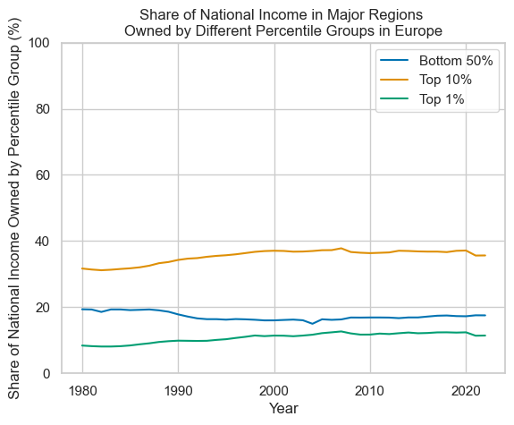
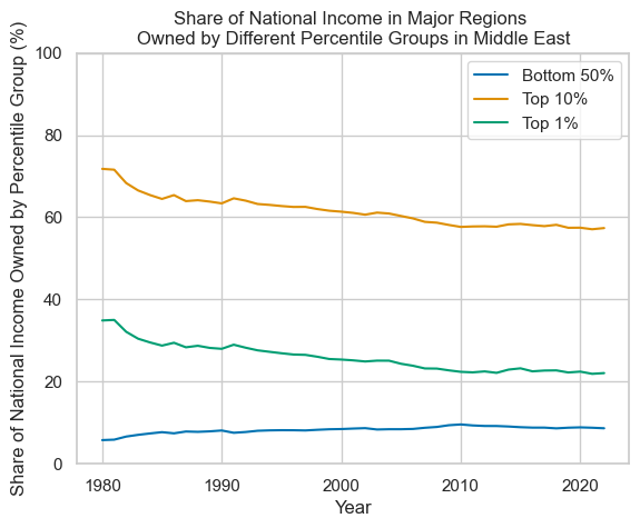
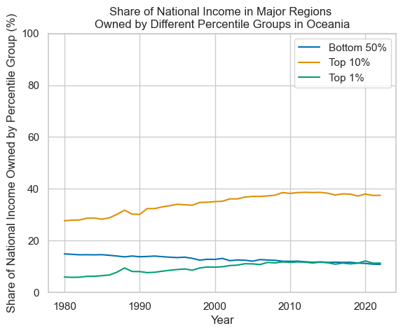
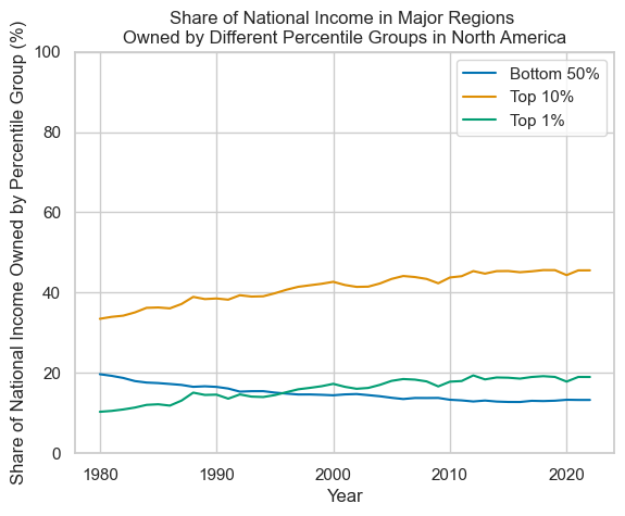
The data plotted here shows estimates of the relative share of national income owned by different groups of the population (those in the bottom 50% of the population by wealth, those in the top 10% by wealth, and those in the top 1% by wealth) by region. The aim of selecting these very broad geographical categories was to see (very) generally how estimations in wealth concentration have changed over time. Overall, the data suggests that inequality has been relatively stable in regions such as Africa, Asia, and Latin America. The Middle East has seen a larger decline in inequality, primarily driven by a decline in the share of national income owned by the top 1% of the population. Oceania and North America have seen an increased share of national income owned by the top 10% over this time period. Europe also saw an increase in the share of national income owned by the top 10%, but to a lesser extent than either of these regions.
There are some stark limitations of this data. Whilst there are a few points here-and-there for data before 1980, the vast majority comes form 1980 onwards. This is understandable, as the evidence-base to estimate relative wealth may not be strong enough in enough places for it to make sense to provide regional-aggregates. Due to the unit of analysis selected, most local variation has been swept over, and larger changes in relative estimates within a country are not explored. The WID does provide a rating system to indicate the relative reliability of data, for instance noting that data for countries in Africa is generally quite poor.[5]
Significantly, this contains *pre-tax* income. Dependent on how those in different income brackets are taxed in a given country, whether there are ways for one to reduce the amount one is taxed by, and what redistribution methods look like, this data may exaggerate the level of inequality. Just from this data, it is not clear in what ways not by how much. Further issues with data collection will be discussed in future posts.
Note:
After downloading the CSV files, I removed the first line from the WID-Data file. This can be skipped quite easily in Python and R (for example, by using pandas.read_csv(..., skiprows=\[0])). However, this is noted here as this did change how the first line was interpreted by Python and R.
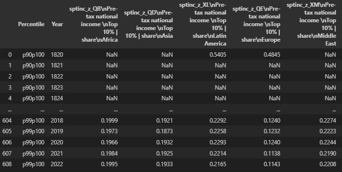
Keeping the first line results in Pandas reading in the header values as:
'sptinc_z_QB\nPre-tax national income \nTop 10% | share\nAfrica': 'Africa'
Without the first line:
'sptinc_z_QB Pre-tax national income Top 10% | share Africa',
The CSV file has a row for every year, even when all values are NULL, and all data is listed chronologically.
Plotting in Python:
The below is performed with a Jupyter Notebook. This can be used online, or via adding an extension to VS Code. https://jupyter.org/ Example: https://jupyter.org/try-jupyter/lab/$1path=notebooks%2FIntro.ipynb https://code.visualstudio.com/docs/datascience/jupyter-notebooks
First, relevant libraries are imported. Pandas is imported to provide a set of high-level tools for data manipulation, and Seaborn is imported for creating plots.
      import pandas as pd
      import seaborn as sns
Then, we can set the style for the plots. The available options are listed on the seaborn website:
https://seaborn.pydata.org/tutorial/aesthetics.html
https://seaborn.pydata.org/tutorial/color_palettes.html
      sns.set()

      sns.set_theme(
                     style='whitegrid',
                     palette='colorblind'
                     )
Afterwards, the csv file can be read into a data frame (effectively a table of data). With Jupyter Notebooks, if the name of a variable is listed at the end of a cell, it will print off the data in that variable.
      region_data = pd.read_csv(
                                 "path_to_csv_file.csv",
                                 sep = ";"
                              )

      region_data
We can then check which columns exist, and which values exist within a given column. We can also rename the columns to something more compact.
      region_data['Percentile'].unique()
      # array(['p90p100', 'p0p50', 'p99p100'], dtype=object)

      region_data.columns
      #Index([
      # 'Percentile',
      # 'Year',
      # 'sptinc_z_QB\nPre-tax national income \nTop 10% | share\nAfrica',
      # 'sptinc_z_QD\nPre-tax national income \nTop 10% | share\nAsia',
      # 'sptinc_z_XL\nPre-tax national income \nTop 10% | share\nLatin America',
      # 'sptinc_z_QE\nPre-tax national income \nTop 10% | share\nEurope',
      # 'sptinc_z_XM\nPre-tax national income \nTop 10% | share\nMiddle East',
      # 'sptinc_z_QF\nPre-tax national income \nTop 10% | share\nOceania',
      # 'sptinc_z_QP\nPre-tax national income \nTop 10% | share\nNorth America'
      # ], dtype='object')

      region_data= region_data.rename(columns={
      'sptinc_z_QB Pre-tax national income Top 10% | share Africa': 'Africa',
      'sptinc_z_QD Pre-tax national income Top 10% | share Asia': 'Asia',
      'sptinc_z_XL Pre-tax national income Top 10% | share Latin America': 'Latin America',
      'sptinc_z_QE Pre-tax national income Top 10% | share Europe': 'Europe',
      'sptinc_z_XM Pre-tax national income Top 10% | share Middle East': 'Middle East',
      'sptinc_z_QF Pre-tax national income Top 10% | share Oceania': 'Oceania',
      'sptinc_z_QP Pre-tax national income Top 10% | share North America': 'North America'
      })
A this is time series data, let's make sure that the Year column contains datetime values, and then plot the data.
      pd.to_datetime(region_data['Year'])
      # 0 1970-01-01 00:00:00.000001820
      # 1 1970-01-01 00:00:00.000001821
      # 2 1970-01-01 00:00:00.000001822
      # 3 1970-01-01 00:00:00.000001823
      # 4 1970-01-01 00:00:00.000001824
      # ...
      # 604 1970-01-01 00:00:00.000002018
      # 605 1970-01-01 00:00:00.000002019
      # 606 1970-01-01 00:00:00.000002020
      # 607 1970-01-01 00:00:00.000002021
      # 608 1970-01-01 00:00:00.000002022
      # Name: Year, Length: 609, dtype: datetime64[ns]

      region_data.set_index('Year').plot(
      title='Share of National Income in Major Regions \nOwned by Different Percentile Groups',
      xlabel='Share of National Income Owned by Percentile group',
      ylabel='Year'
      )
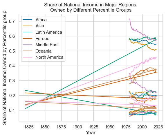
This is very messy. With the simple plotting command used above, the legend doesn't say which line refers to which percentile, defeating the purpose of the plot. Including the data from before 1980 indicates that the spread of wealth owned has increased, but it hasn't plotted correctly. As there isn't too much data from before 1980 here, let's focus on plotting the data since 1980. The y-axis would also benefit from being scaled to a percentage rather than a 0-1 scale.
One way to separate out the plots for different percentiles is filter for the columns of interest, use one column to group the data, and then to produce plots.
      region_data \
         .loc[region_data['Year'] > 1979]\
         [['Year', 'Percentile', 'Africa']]\
         .set_index('Year')\
         .groupby(['Percentile'])\
         .plot(
            title='Share of National Income in Major Regions \nOwned by Different Percentile Groups',
            xlabel='Year',
            ylabel='Share of National Income Owned by Percentile Groups'
         )
Percentile
p0p50 Axes(0.125,0.11;0.775x0.77)
p90p100 Axes(0.125,0.11;0.775x0.77)
p99p100 Axes(0.125,0.11;0.775x0.77)
dtype: object
At the moment, the dataframe is quite 'long', in that values by percentile are stacked one-on-top-of-each-other rather than having separate columns for each combination of region and percentile (e.g. Africa: Top 10% by wealth).
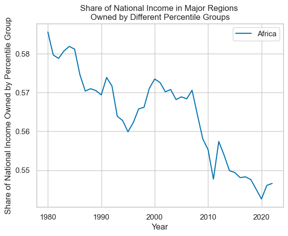
One can take a subset of columns of interest, pivot the data frame on 'Percentile', and then plot.
      # Multiply all values in the 'Africa' column by 100.
      region_data["Africa"] = region_data["Africa"] * 100

      # Take the subset of columns of interest
      region_subset = region_data[["Year", "Percentile", "Africa"]]

      # Filter for rows where Year > 1979, and then pivot the data from a 'long' to 'wide' format.
      region_and_percentile = region_data\
         .loc[region_data["Year"] > 1979]\
         .pivot(index="Year", columns="Percentile", values="Africa")
Note that pivoting causes the data frame to change from this format:
      # Data before pivoting:
      region_data
         .loc[region_data['Year'] > 1979]\
         [['Year', 'Percentile', 'Africa']]\
         .head
      # <bound method NDFrame.head of
      #     Year Percentile Africa
      # 160 1980 p90p100    58.56
      # 161 1981 p90p100    57.97
      # 162 1982 p90p100    57.88
      # 163 1983 p90p100    58.07
      # 164 1984 p90p100    58.19
      # .. ... ... ...
      # 604 2018 p99p100    19.99
      # 605 2019 p99p100    19.73
      # 606 2020 p99p100    19.66
      # 607 2021 p99p100    19.84
      # 608 2022 p99p100    19.95
      #
      # [129 rows x 3 columns]>
To this:
      region_data\
         .loc[region_data['Year'] > 1979]\
         [['Year', 'Percentile', 'Africa']]\
         .pivot(index='Year', columns='Percentile', values='Africa')\
         .head
      # <bound method NDFrame.head of Bottom 50 percent Top 10 percent Top 1 percent
      # Year
      # 1980                          7.01              58.56           21.83
      # 1981                          7.19              57.97           21.51
      # 1982                          7.26              57.88           21.53
      # 1983                          7.16              58.07           21.57
      # 1984                          6.94              58.19           21.56
      # 1985                          6.98              58.12           21.59
      # 1986                          7.12              57.46           21.05
      # 1987                          7.13              57.04           20.66
      # 1988                          7.06              57.10           20.57
      # 1989                          6.98              57.05           20.51
      # 1990                          6.94              56.94           20.25
      # 1991                          6.78              57.39           20.46
      # 1992                          6.69              57.17           20.28
      # 1993                          6.81              56.39           19.60
      # 1994                          6.74              56.28           19.47
      # 1995                          6.85              55.99           19.30
      # ...
Afterwards, rename the columns to something more convenient:
      # Current column names: preferred column names
      percentile_group_renaming_dict = {
         "p0p50": "Bottom 50 percent",
         "p90p100": "Top 10 percent",
         "p99p100": "Top 1 percent",
      }

      # Data frame column names are a list of strings, so one can use a list comprehension
      # to replace the list.
      region_and_percentile.columns = [
         percentile_group_renaming_dict[cn] for cn in region_and_percentile.columns
      ]

      # Then plot the data, providing a title, and setting the y-axis to use a scale of 0 to 100.
      region_and_percentile.plot(
         title="Share of National Income in Major Regions \nOwned by Different Percentile Groups in Africa",
         xlabel="Year",
         ylabel="Share of National Income Owned by Percentile Group (%)",
         ylim=(0, 100),
      )
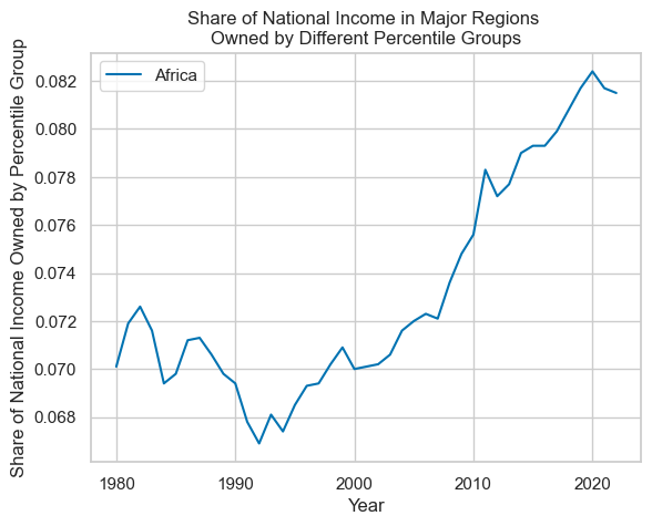
To make a separate plot for each region, these steps can all be placed into a function, and that function can be called for each region.
      def pivot_df_on_column_and_plot(
         data_frame_in, column_with_data_to_plot, subset_column_names
      ):
         values_as_percentages = data_frame_in[subset_column_names]
         values_as_percentages.loc[:, column_with_data_to_plot] = values_as_percentages[column_with_data_to_plot] * 100

         pivoted_data = values_as_percentages\
            [subset_column_names]\
            .pivot(
                     index='Year',
                     columns='Percentile',
                     values=column_with_data_to_plot
                  )

         pivoted_data.columns = [
            percentile_group_renaming_dict[cn] for cn in pivoted_data.columns
         ]

         pivoted_data.plot(
            title="Share of National Income in Major Regions \nOwned by Different Percentile Groups in " + column_with_data_to_plot,
            xlabel="Year",
            ylabel="Share of National Income Owned by Percentile Group (%)",
            ylim=(0, 100),
         )
      for region in list_of_regions:
      pivot_df_on_column_and_plot(
         region_data.loc[region_data['Year'] > 1979],
         r,
         ['Year', 'Percentile', r]
      )
Plotting with R
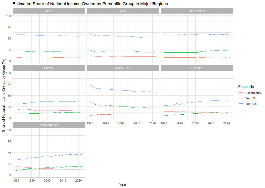
With R, I decided to plot all of the charts together on a single chart. Initially, the plots were stacked one-on-top-of-each-other to allow the reader to scan down and compare regional changes against each other. However, due to the number of plots this made it quite hard to see the changes in each line. Therefore, the data was then plotted such that each region had more vertical space and changes over time were more obvious.
The below code was run with RStudio.
Before starting, the tidyverse packages were installed to allow for ease of data manipulation and plotting.
      # Install tidyverse from CRAN.
      install.packages("tidyverse")
Then relevant libraries need to be imported.
      # Import tidyverse functions.
      library(tidyverse) # for data cleaning and plotting functions.
      library(magrittr) # for the %>% pipe operator.
      library(dplyr)
After that, one can read in the data from the CSV.
      region_data <- read.csv(
         "./WID_Data_regions/WID_Data_Metadata/WID_Data_02012024-235418.csv",
         header = TRUE,
         sep = ";"
      )
Given how ungainly the column names are in the CSV file, it would be better to replace them. To see how R interpreted them, one can loop over the list of names:
      for (cn in colnames(region_data)) {
         print(cn)
      }
      # [1] "Percentile"
      # [1] "Year"
      # [1] "sptinc_z_QB.Pre.tax.national.income.Top.10....share.Africa"
      # [1] "sptinc_z_QD.Pre.tax.national.income.Top.10....share.Asia"
      # [1] "sptinc_z_XL.Pre.tax.national.income.Top.10....share.Latin.America"
      # [1] "sptinc_z_QE.Pre.tax.national.income.Top.10....share.Europe"
      # [1] "sptinc_z_XM.Pre.tax.national.income.Top.10....share.Middle.East"
      # [1] "sptinc_z_QF.Pre.tax.national.income.Top.10....share.Oceania"
      # [1] "sptinc_z_QP.Pre.tax.national.income.Top.10....share.North.America"
'Spare' appears in each one, followed by the name of the region. Therefore, for each column name, one can find the index of where 'spare' starts, add six character to get the index for where the region name starts, take that as a subset of the string, and then replace the period character with a space.
      # We can search for 'spare' and rename all of the columns.
      extract_country_name <- function(string_in) {
      # https://www.statology.org/r-find-character-in-string/
      spare_index <- tail(unlist(gregexpr('share', string_in)), n=1)
         if (spare_index > -1) {
            return(gsub(".", " ", substr(string_in, spare_index + 6, nchar(string_in)), fixed=TRUE))
         }
         return(string_in)
      }

      # Use map to feed each column name into the function.
      # A for-loop could also be used here.
      new_col_names = map(colnames(region_data), extract_country_name)
      new_col_names
      # [[1]]
      # [1] "Percentile"
      # [[2]]
      # [1] "Year"
      # [[3]]
      # [1] "Africa"
      # [[4]]
      # [1] "Asia"
      # [[5]]
      # [1] "Latin America"
      # [[6]]
      # [1] "Europe"
      # [[7]]
      # [1] "Middle East"
      # [[8]]
      # [1] "Oceania"
      # [[9]]
      # [1] "North America"

      # Replace the column names of region-data
      colnames(region_data) <- new_col_names
Rather unexpectedly, in replacing the column names, one calls the function `colnames()` on the data frame of interest, and then directs the new names into it. Syntactically, I would have expected this syntax to return a list of column names, rather than a reference to the list of column names which one can update. Now to check what data we have:
      # Check the first few rows of data:
      head(region_data)
      #   Percentile Year Africa Asia Latin America Europe Middle East Oceania North America
      # 1    p90p100 1820     NA   NA        0.5405 0.4845          NA  0.4429        0.4221
      # 2    p90p100 1821     NA   NA            NA     NA          NA      NA            NA
      # 3    p90p100 1822     NA   NA            NA     NA          NA      NA            NA
      # 4    p90p100 1823     NA   NA            NA     NA          NA      NA            NA
      # 5    p90p100 1824     NA   NA            NA     NA          NA      NA            NA
      # 6    p90p100 1825     NA   NA            NA     NA          NA      NA            NA

      # Check the last few rows of data:
      tail(region_data)
      #     Percentile Year Africa   Asia Latin America Europe Middle East Oceania
      # 604    p99p100 2017 0.1998 0.1932        0.2189 0.1238      0.2270  0.1135
      # 605    p99p100 2018 0.1999 0.1921        0.2292 0.1240      0.2274  0.1106
      # 606    p99p100 2019 0.1973 0.1873        0.2258 0.1232      0.2223  0.1133
      # 607    p99p100 2020 0.1966 0.1932        0.2293 0.1240      0.2244  0.1219
      # 608    p99p100 2021 0.1984 0.1925        0.2214 0.1138      0.2190  0.1133
      # 609    p99p100 2022 0.1995 0.1933        0.2165 0.1143      0.2208  0.1135

      # Check data types.
      sapply(region_data, class)
      #  Percentile     Year          Africa       Asia        Latin America     Europe
      #  "character"    "integer"     "numeric"    "numeric"   "numeric"         "numeric"
      #  Middle East    Oceania North America
      #  "numeric"      "numeric"     "numeric"
For plotting, we'll use ggplot2. This requires data to be in a 'long' format, where each row represents a single observation.[6] From the above, the data frame is not yet in a suitable form to make this possible.
We can take the data frame, pipe it into the `gather` function, and say that we want to gather the values for each region into a single column.
      region_data_long <- region_data %>%
         gather(region, value, 'Africa':'North America', factor_key=TRUE)
Checking the data again, we can see it is in the correct format:
      head(region_data_long)
      #   Percentile Year region value
      # 1    p90p100 1820 Africa    NA
      # 2    p90p100 1821 Africa    NA
      # 3    p90p100 1822 Africa    NA
      # 4    p90p100 1823 Africa    NA
      # 5    p90p100 1824 Africa    NA
      # 6    p90p100 1825 Africa    NA
The values for Percentile are not entirely obvious to anyone who is unfamiliar with the data. Let's rename them:
      region_data_long$Percentile <- str_replace(region_data_long$Percentile, 'p0p50', 'Bottom 50%')
      region_data_long$Percentile <- str_replace(region_data_long$Percentile, 'p90p100', 'Top 10%')
      region_data_long$Percentile < str_replace(region_data_long$Percentile, 'p99p100', 'Top 1%')
We can now plot the data for each region. `facet_grid()` will allow the plots to be stack one-on-top-of-the-other in a single chart. From the earlier exploration with Python, we'll also filter for data from 1980 onwards, and multiply the values by 100 to get percentages.
At each step, we can 'pipe' the result into the next function to chain all of these steps together.
ggplot then requires us to build up the chart piece-by-piece by appending functions to it.
      region_data_long %>%
         filter(
            1980 <= Year
         ) %>%
         transform(value = value * 100) %>%
         ggplot(
            aes(
               x = Year,
               y = value,
               group = Percentile,
               color = Percentile
            )
         ) +
         facet_grid(region~.) +
         ggtitle('Estimated Share of National Income \nOwned by Percentile Group in Major Regions') +
         ylab('Share of National Income Owned by Group (%)') +
         ylim(0, 100) +
         geom_line() +
         theme_light()
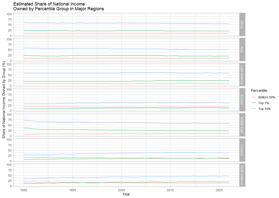
This is hard to read. Using `facet_wrap()` instead, we can produce narrower, but taller plots.
      region_data_long %>%
         filter(
            1980 <= Year
         ) %>%
         transform(value = value * 100) %>%
         ggplot(
            aes(
               x = Year,
               y = value,
               group = Percentile,
               color = Percentile
            )
         ) +
         facet_wrap(region~.) +
            ggtitle('Estimated Share of National Income Owned by Percentile Group in Major Regions') +
         ylab('Share of National Income Owned by Group (%)') +
         ylim(0, 100) +
         geom_line() +
         theme_light()
Go
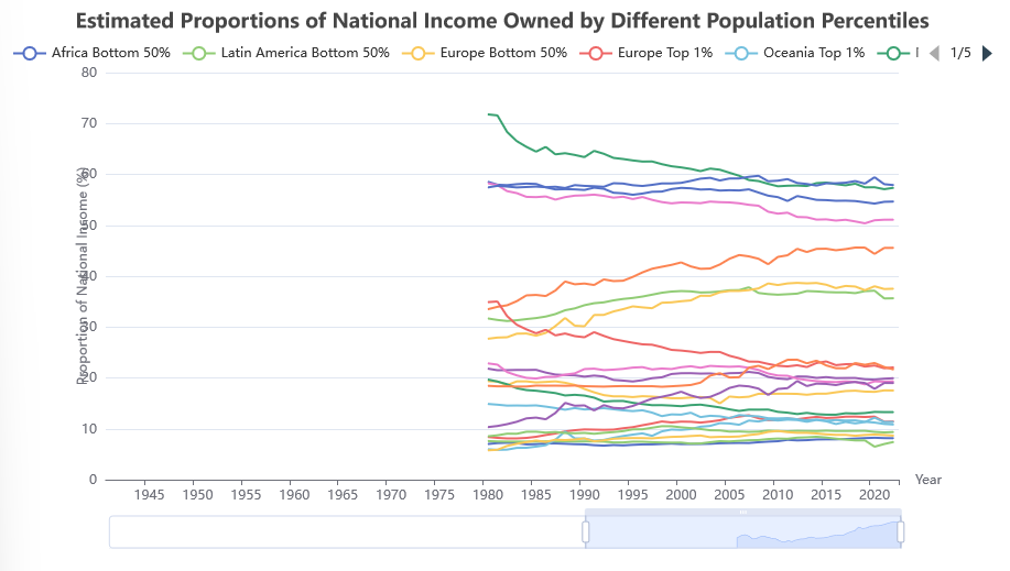
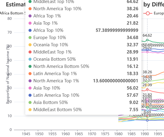
With Go, I decided I would like to produce an interactive plot, where the user can hover over lines to see what their value was at a given point, and hide lines as needed. I opted for Apache eCharts to achieve this, using the go-echarts module to set this up.[7] This same approach would be possible in Python, and I believe would also be possible in R.
All time series data will have to be stored in `[]opts.LineData` to plot on a chart. With the approach taken below, the number of `opts.LineData` in the slice must be the same as the number of years on the x-axis for the data to line up correctly.
There are a couple of different routes we can take to achieve this.
One is to read data in line-by-line, store each row of data in a struct, then the time series data from those structs. Alternatively, one can construct the time series whilst reading the file in. The former approach is covered here, and the latter below.
To achieve this, first load data from the CSV file. Secondly, take these rows of data and construct the 'columns' of data from them. Thirdly, use those 'columns' of data to create a chart. Lastly, render the chart so that the browser can display it when the user navigates to localhost:8080. If we cannot assume that the data is in order when reading it in, then we can use `sort.Slice()` to order the rows by the Year field before creating the time series data.
To start with, I made a new `main.go` file and imported the relevant modules.
      package main

      import (
         "encoding/csv"
         "github.com/go-echarts/go-echarts/v2/charts"    "github.com/go-echarts/go-echarts/v2/opts"    "io"    "log"    "net/http"    "os"    "reflect"    "slices"    "sort"    "strconv")
I declared a couple of structs to help Then, I declared structs that I would use for convenience when reading data from the CSV file in. `rowOfRegionInequalityData` is based on the format of the CSV file, and declares many of the float values as float64s. When reading data it, it is read line-by-line. For plotting, however, I will need time series .
`regionAndPercentile` is a separate struct for
      type regionAndPercentile struct {
         Region     string
         Percentile string
      }
As above, I would like the rename the columns to something more recognisable. A hashmap can be used for this.
      var percentileMap = map[string]string{
         "p0p50":   "Bottom 50%",
         "p90p100": "Top 10%",
         "p99p100": "Top 1%",
      }
The main function can start a web server, allowing one to view the plot in the browser (here, at the URL localhost:8080).
      func main() {
         http.HandleFunc("/", displayInequalityDataChart)
         http.ListenAndServe(":8080", nil)
      }
To confirm that the correct data types are used, I created a struct with fields to match each column. Note that this still only stores a row of data, it just makes it easier to match up values into columns later on.
      type rowOfRegionInequalityData struct {
         Percentile   string
         Year         int
         Africa       float64
         Asia         float64
         LatinAmerica float64
         Europe       float64
         MiddleEast   float64
         Oceania      float64
         NorthAmerica float64
      }

      func displayInequalityDataChart(w http.ResponseWriter, _ *http.Request) {
         rowsOfData := loadCSVData(os.Args[1])
         timeSeriesData, years := convertRowsOfInequalityDataIntoMapOfRegionPercentileToLineData(rowsOfData)
         linesChart := createTimeSeriesLineChart(timeSeriesData, years)
         linesChart.Render(w)
      }

      // ...
Rows can also be sorted by the value of a given field such as year. Here, the data is in chronological order already, and can safely be skipped.
      // sortRowsOfInequalityByYear sorts values in place in memory.
      func sortRowsOfInequalityByYear(ineqRows []rowOfRegionInequalityData) {
         sort.Slice(ineqRows, func(i int, j int) bool {
            return ineqRows[i].Year < ineqRows[j].Year
         })
      }
Reading in the CSV data is relatively straight forward. Using our struct above, we can match up column numbers to the fields in the struct (e.g. `lineOfCSVData[2]` is fed into `rowOfdata.Africa`).
A helper function can be used to do much of this data-wrangling. Note that `loadCSVData` could return `[][]string` and then those can be converted into `[]rowOfRegionInequalityData`. Here, I opted to do the processing before returning, so that only one pass of the rows of data is required.
As a convention, if a there is not data for a given year, region, and percentile combination, I set the value to -1. Whilst `opts.LineData` will take `nil` for missing values, I didn't want to give up the type-checking in `rowOfRegionInequalityData` by replacing all of the `float64` types with `interface{}` in the event that I missed parsing one of the strings from the csv file into a float. -1 was chosen as it should be an impossible number. However, it does introduce a convention to be aware of, which, preferably, would be removed.
There is a fair amount of copy-and-pasted code here, and it is easy to mis-type and thus read the wrong values for a given column into the current `rowOfRegionInequalityData`.
      // main function, etc...

      func loadCSVData(pathToCSV string) []rowOfRegionInequalityData {
         // An empty slice is declared here so that there is no nil pointer exceptions
         // when appending to this slice later on.
         var csvData = []rowOfRegionInequalityData{}

         file, err := os.Open(pathToCSV)
         if err != nil {
            log.Print("error when reading file:", err)
         }
         defer file.Close()

         csvR := csv.NewReader(file)
         csvR.Comma = ';'

         // skip first row, which contains the column names
         csvR.Read()

         for {
            newLine, err := csvR.Read()
            if err == io.EOF {
               return csvData
            }
            if err != nil {
               log.Println("error when reading new line from file:", err)
            }

            csvData = append(
                     csvData,
                     convertSliceOfStingDataIntoRowOfRegionInequalityData(newLine),
                  )
         }

         return csvData
      }

      func convertSliceOfStingDataIntoRowOfRegionInequalityData(rowIn []string) rowOfRegionInequalityData {
         var rowToReturn = rowOfRegionInequalityData{
            Percentile: rowIn[0],
         }

         yearInt, err := strconv.Atoi(rowIn[1])
         if err != nil {
            log.Println("unable to convert string of year value into int:", err)
         }
         rowToReturn.Year = yearInt

         if rowIn[2] == "" {
            rowToReturn.Africa = -1
         } else {
            rowToReturn.Africa, err = strconv.ParseFloat(rowIn[2], 32)
            if err != nil {
               log.Println("unable to convert string for Africa value into int:", err)
            }
         }

         if rowIn[3] == "" {
            rowToReturn.Asia = -1
         } else {
            rowToReturn.Asia, err = strconv.ParseFloat(rowIn[3], 32)
            if err != nil {
               log.Println("unable to convert string for Asia value into int:", err)
            }
         }

         if rowIn[4] == "" {
            rowToReturn.LatinAmerica = -1
         } else {
            rowToReturn.LatinAmerica, err = strconv.ParseFloat(rowIn[4], 32)
            if err != nil {
               log.Println("unable to convert string for Latin America value into int:", err)
            }
         }

         if rowIn[5] == "" {
            rowToReturn.Europe = -1
         } else {
            rowToReturn.Europe, err = strconv.ParseFloat(rowIn[5], 32)
            if err != nil {
               log.Println("unable to convert string for Europe value into int:", err)
            }
         }

         if rowIn[6] == "" {
            rowToReturn.MiddleEast = -1
         } else {
            rowToReturn.MiddleEast, err = strconv.ParseFloat(rowIn[6], 32)
            if err != nil {
               log.Println("unable to convert string for Middle East value into int:", err)
            }
         }

         if rowIn[7] == "" {
            rowToReturn.Oceania = -1
         } else {
            rowToReturn.Oceania, err = strconv.ParseFloat(rowIn[7], 32)
            if err != nil {
               log.Println("unable to convert string for Oceania value into int:", err)
            }
         }

         if rowIn[8] == "" {
            rowToReturn.NorthAmerica = -1
         } else {
            rowToReturn.NorthAmerica, err = strconv.ParseFloat(rowIn[8], 32)
            if err != nil {
               log.Println("unable to convert string for North America value into int:", err)
            }
         }

         return rowToReturn
      }
Afterwards, convert the `[]rowOfRegionInequalityData` into a `map[regionAndPercentile][]opts.LineData`. I've used a map here to avoid having to hard-core all combinations of regions and percentiles, and to allow for quick access to the time series data when creating the chart.
To shorten the code, I used reflection to read the names of the fields in the type `rowOfRegionInequalityData`.
If a data point is missing, then go-echarts will take a `nil` value and plot correctly.
      // convertRowsOfInequalityDataIntoMapOfRegionPercentileToLineData assumes that// the header row is not included in the ineqRows data.
      // It further assumes that ineqRows are sorted by Year.
      // If a 'value' is -1, then it is assumed to be a missing value.
      // In this case, nil will be included in the opts result, so that there are
      // enough opts.LineData to plot on the graph, but missing variables are not// shown.
      func convertRowsOfInequalityDataIntoMapOfRegionPercentileToLineData(ineqRows []rowOfRegionInequalityData) (map[regionAndPercentile][]opts.LineData, []int) {
         var regionAndPercentileToData = map[regionAndPercentile][]opts.LineData{}
         var years = []int{}
         var existingRandPs = []regionAndPercentile{}

         for _, r := range ineqRows {
            if !slices.Contains(years, r.Year) {
               years = append(years, r.Year)
            }

            // reflection is used here to avoid duplicating code.
            fields := reflect.ValueOf(r)
            for i := 2; i < fields.NumField(); i++ {
               fieldName := fields.Type().Field(i).Name
               fieldValue := fields.Field(i)

               rAndP := regionAndPercentile{Region: fieldName, Percentile: r.Percentile}
               if !slices.Contains(existingRandPs, rAndP) {
                  regionAndPercentileToData[rAndP] = []opts.LineData{}
                  existingRandPs = append(existingRandPs, rAndP)
               }

               if fieldValue.Float() != -1.0 {
                  regionAndPercentileToData[rAndP] = append(regionAndPercentileToData[rAndP], opts.LineData{Value: fieldValue.Float() * 100})
               } else {
                  regionAndPercentileToData[rAndP] = append(regionAndPercentileToData[rAndP], opts.LineData{Value: nil})
               }

            }
         }

         return regionAndPercentileToData, years
      }
This data can then be read off to produce the line chart, which will be rendered back up in the `displayInequalityDataChart` function.
A number of aspects of the echart are hard-coded here. For example, users can hover their mice over the line data to see what a particular data point it. Additionally, one can link on the lend to hide/show a particular line.
      func createTimeSeriesLineChart(timeSeriesData map[regionAndPercentile][]opts.LineData, years []int) *charts.Line {
         linesChart := charts.NewLine()

         linesChart.SetXAxis(years)

         for key, timeSeries := range timeSeriesData {
            linesChart.AddSeries(
               key.Region+" "+percentileMap[key.Percentile],
               timeSeries,
            ).SetSeriesOptions(charts.WithLabelOpts(
               opts.Label{
                  Show:     true,
                  Position: "top",
               }))
         }

         linesChart.SetGlobalOptions(
            charts.WithInitializationOpts(
               opts.Initialization{
                  PageTitle: "Inequality plot",
               },
            ),
            charts.WithTitleOpts(
               opts.Title{
                  Title: "Estimated Ownsership National Income",
                  Left:  "center",
               },
            ),
            charts.WithXAxisOpts(
               opts.XAxis{
                  Show: true,
                  Name: "Year",
               },
            ),
            charts.WithYAxisOpts(
               opts.YAxis{
                  Show:         true,
                  Name:         "Proportion of National Income (%)",
                  NameLocation: "middle",
               },
            ),
            charts.WithLegendOpts(
               opts.Legend{
                  Show:      true,
                  ItemWidth: 30,
                  Type:      "scroll",
                  Top:       "30",
               },
            ),
            charts.WithDataZoomOpts(
               opts.DataZoom{
                  Start:      60,
                  End:        100,
                  XAxisIndex: []int{0},
               },
            ),
            charts.WithTooltipOpts(
               opts.Tooltip{
                  Show:    true,
                  Trigger: "axis",
               },
            ),
         )

         return linesChart
      }
To run, open a command line, use the `cd` command to navigate to the directory containing main.go, and start the program with `go run main.go [path_to_csv_file_with_inequality_data]`. Then open a browser and navigate to localhost:8080 to view the plot.
Whilst the above approach makes it easy to see what happens at each step, there were a lot of placeholder variables assigned. There was also a fair amount of repeated code where it was easy to make a mistype, and conventions such as using -1 to indicate a missing value.
To avoid some of the above issues, one can construct the `[]opts.LineData` earlier on. A struct and some methods can make this quite easy.
First, we'll we'll create a new directory called `inequalityTimeSeries` with an `inequalityTimeSeries.go` file in it. Here, we';; declare the structs to use. Here, `TimeSeriesData` will do the heavy lifting, keeping all of the years information, existing combinations of regions and percentiles, and the `[]opts.LineData` in a single location. We'll keep the `RegionAndPercentile` struct from before for now.
Note that all relevant struct names and methods have to start with a capital letter, so that the functions in `main.go `can access them.
      package inequalityTimeSeries

      // imports...

      type RegionAndPercentile struct {
         Region     string
         Percentile string
      }

      type TimeSeriesData struct {
         CSVFileColumnToRegionNameMap map[int]string
         ColumnRenamingMap            map[string]string
         Years                        []int
         ExistingRAndPs               []RegionAndPercentile
         TimeSeries                   map[RegionAndPercentile][]opts.LineData
      }
The first two fields can either be assigned directly, or with setter functions.
      func (ts *TimeSeriesData) SetCSVFileColumnToRegionNameMap(mapToUse map[int]string) {
         ts.CSVFileColumnToRegionNameMap = mapToUse
      }

      func (ts *TimeSeriesData) SetColumnRenamingmap(mapToUse map[string]string) {
         ts.ColumnRenamingMap = mapToUse
      }
For year values, as before, we will only add a year to the slice if it is not already in the slice. This does require looping through the year values for each row. However, as we are not dealing with a very large number of rows the performance hit is not noticeable. We could have only checked the final value in the list, assuming that all year values in the original data are grouped together, and chronological (e.g. 2000, 2000, 2000, 2001, 2001, 2001, 2002, 2002, 2002, etc... rather than 2000, 2001, 2002, 2000, 2001, 2002, etc...).
      func (ts *TimeSeriesData) appendIfNotInYearsList(newYear int) {
         if !slices.Contains(ts.Years, newYear) {
            ts.Years = append(ts.Years, newYear)
         }
      }
Adding a data point to one of the time series can be dealt with in a method (which we won't allow other files to access). If a region and percentile combination has not been seen yet, a new slice is added to the map. Additionally, the convention of using -1 for a null value has been replace with a `setToNil` parameter. When this is true, we ignore `value` and append a `opts.LineData{Value: nil}`.
      func (ts *TimeSeriesData) addDataPoint(rAndP RegionAndPercentile, value float64, setToNil bool) {
         if !slices.Contains(ts.ExistingRAndPs, rAndP) {
            ts.TimeSeries[rAndP] = []opts.LineData{}
            ts.ExistingRAndPs = append(ts.ExistingRAndPs, rAndP)
         }

         if setToNil {
            ts.TimeSeries[rAndP] = append(ts.TimeSeries[rAndP], opts.LineData{Value: nil})
         } else {
            ts.TimeSeries[rAndP] = append(ts.TimeSeries[rAndP], opts.LineData{Value: value})
         }
      }
The loadCSVData function is now a method. This is still tightly-coupled with the format of the original CSV file.
      func (ts *TimeSeriesData) LoadCSVDataIntoInequalityTimeSeries(pathToCSV string) {
         file, err := os.Open(pathToCSV)
         if err != nil {
            log.Print("error when reading file:", err)
         }
         defer file.Close()

         csvR := csv.NewReader(file)
         csvR.Comma = ';'

         // skip first row, which contains the column names
         csvR.Read()

         for {
            newLine, err := csvR.Read()
            if err == io.EOF {
               return
            }
            if err != nil {
               log.Println("error when reading new line from file:", err)
            }

            ts.updateYearsAndRegionAndPercentileDataWithNewRow(newLine)
         }
      }
As before, data is extracted from the columns by index. Unlike before, we skip the step of creating stepping-stone structs of row data and instead immediately parse the data and append it to the time series.
      func (ts *TimeSeriesData) updateYearsAndRegionAndPercentileDataWithNewRow(newLine []string) {
         yearVal, err := strconv.Atoi(newLine[1])
         if err != nil {
            slog.Error(
               "could not convert string of year value to int",
               "val in:", newLine[1],
               "err", err,
            )
         }
         ts.appendIfNotInYearsList(yearVal)

         for i := 2; i < len(newLine); i++ {
            if newLine[i] == "" {
               ts.addDataPoint(
                  RegionAndPercentile{Region: ts.CSVFileColumnToRegionNameMap[i], Percentile: newLine[0]},
                  0,
                  true,          )

            } else {
               valInCol, err := strconv.ParseFloat(newLine[i], 64)
               if err != nil {
                  slog.Error(
                     "unable to parse string into float",
                     "string:", newLine[i],
                     "err", err,
                  )
               }
               ts.addDataPoint(
                  RegionAndPercentile{Region: ts.CSVFileColumnToRegionNameMap[i], Percentile: newLine[0]},
                  valInCol*100,
                  false,          )
            }
         }
      }
After that's done, we can plot the line chart. I've opted to move the `render` method to the end of this method, on the assumption that as soon as one creates the chart, one would want to see it. An alternatively would have been to add a `*Line` filed to the `timeSeriesData` struct, which would allow other functions to call `render` when best suits them.
      func (ts *TimeSeriesData) CreateAndDisplayTimeSeriesLineChart(w io.Writer) {
         linesChart := charts.NewLine()

         linesChart.SetXAxis(ts.Years)

         for key, timeSeries := range ts.TimeSeries {
            linesChart.AddSeries(
               key.Region+" "+ts.ColumnRenamingMap[key.Percentile],
               timeSeries,
            ).SetSeriesOptions(charts.WithLabelOpts(
               opts.Label{
                  Show:     true,
                  Position: "top",
               }))
         }

         linesChart.SetGlobalOptions(
            charts.WithInitializationOpts(
               opts.Initialization{
                  PageTitle: "Inequality plot",
               },
            ),
            charts.WithTitleOpts(
               opts.Title{
                  Title: "Estimated Ownership of National Income",
                  Left:  "center",
               },
            ),
            charts.WithXAxisOpts(
               opts.XAxis{
                  Show: true,
                  Name: "Year",
               },
            ),
            charts.WithYAxisOpts(
               opts.YAxis{
                  Show:         true,
                  Name:         "Proportion of National Income (%)",
                  NameLocation: "middle",
               },
            ),
            charts.WithLegendOpts(
               opts.Legend{
                  Show:      true,
                  ItemWidth: 30,
                  Type:      "scroll",
                  Top:       "30",
               },
            ),
            charts.WithDataZoomOpts(
               opts.DataZoom{
                  Start:      60,
                  End:        100,
                  XAxisIndex: []int{0},
               },
            ),
            charts.WithTooltipOpts(
               opts.Tooltip{
                  Show:    true,
                  Trigger: "axis",
               },
            ),
         )

         linesChart.Render(w)
      }
The `main` function and `displayInequalityDataChart` function can now be updated to:
      func main() {
         http.HandleFunc("/", displayInequalityDataChart)
         http.ListenAndServe(":8080", nil)
      }

      func displayInequalityDataChart(w http.ResponseWriter, _ *http.Request) {
         var regionAndPercentileData = inequalityTimeSeries.TimeSeriesData{
            Years:          []int{},
            ExistingRAndPs: []inequalityTimeSeries.RegionAndPercentile{},
            TimeSeries:     map[inequalityTimeSeries.RegionAndPercentile][]opts.LineData{},
         }
         regionAndPercentileData.SetCSVFileColumnToRegionNameMap(
            map[int]string{
               2: "Africa",
               3: "Asia",
               4: "Latin America",
               5: "Europe",
               6: "MiddleEast",
               7: "Oceania",
               8: "North America",
            },
         )
         regionAndPercentileData.SetColumnRenamingmap(
            map[string]string{
               "p0p50":   "Bottom 50%",
               "p90p100": "Top 10%",
               "p99p100": "Top 1%",
            },
         )
         regionAndPercentileData.LoadCSVDataIntoInequalityTimeSeries(os.Args[1])
         regionAndPercentileData.CreateTimeSeriesLineChart(w)
      }
There are some rounding errors which look quite ungainly.
Discussions online (e.g. [8]) suggest splitting the string and using ParseInt to avoid these rounding errors. Converting back into floats, however, re-introduces the rounding error. Given that we are looking at the 'big picture' here, converting the values to integers might be acceptable, and I've followed this path. This is far from ideal, however, as for economies as large as the USA's this rounding error still represents millions of dollars in national income.
The two changes required for this are in the signature of `addDataPoint` and the call to it in `updateYearsAndRegionAndPercentileDataWithNewRow`:
      func (ts *TimeSeriesData) addDataPoint(rAndP RegionAndPercentile, value int, setToNil bool) {
         //...
      }

      func (ts *TimeSeriesData) updateYearsAndRegionAndPercentileDataWithNewRow(newLine []string) {
         //...
         ts.addDataPoint(
            RegionAndPercentile{Region: ts.CSVFileColumnToRegionNameMap[i], Percentile: newLine[0]},
            int(valInCol*100),
            false,)
         //...
      }
The interactive chart itself:
Conclusion
At a regional level, the WID's pre-tax figues suggest that change in inequality are relatively uneven between regions over the last forty years, as one would expect. Eye-balling the charts, the Middle East and North America have seen more changes towards reductions and increases in the share of national income owned by different percentile groups, whilst region such as Africa have seen very little change. Once again, these do gloss over country-level changes, together with differences in the quality of data and types of sources used. Going forwards, I will look at other research in the area to draw out why reseachers have reached differing conclusions on changes in inequality.
In terms of plotting, Python and R were by far the most straight-forward for producing some simple exploratory plots. There is some more code for Python, owing to it being used first, and therefore some additional exploration being done in that language. Go was perfectly acceptable for plotting data. Getting the data into a form where Apache Echarts could be used was somewhat more time-consuming, but not overly complicated. Going forwards, I'll continue plotting with Apache Echarts where suitable.
All code is available on GitHub
Update
This post has been updated to correct some formatting issues.
[1] World inequality Database, https://wid.world/, accessed: 2023-01-04
[2] The Economist. “Why Economists Are at War over Inequality.” _The Economist_, November 30, 2023. https://www.economist.com/finance-and-economics/2023/11/30/income-gaps-are-growing-inexorably-arent-they, citing Auten, Gerald, and David Splinter. "Income inequality in the United States: Using tax data to measure long-term trends." (2019).
[3] For example: Piketty, Thomas, Gilles Postel-Vinay, and Jean-Laurent Rosenthal. "Wealth concentration in a developing economy: Paris and France, 1807-1994." American economic review 96, no. 1 (2006): 236-256.; Piketty, Thomas. Capital in the twenty-first century. Harvard University Press, 2014.
[4] World inequality Database, https://wid.world/data/, accessed: 2023-01-04
[5] World inequality Database, Home Data Page: https://wid.world/world/#sptinc_p90p100_z/US;FR;DE;CN;ZA;GB;WO/last/eu/k/p/yearly/s/false/24.722500000000004/80/curve/false/country, accessed: 2023-01-04
[6] Hadley, Wickham. "Tidy data." Journal of Statistical Software 59, no. 10 (2014): 1-23.; see also: https://cran.r-project.org/web/packages/tidyr/vignettes/tidy-data.html
[7] Apache Software Foundation, Apache Echarts 5.4: https://echarts.apache.org/en/index.html, accessed: 2024-01-02; chenjiandongx, Koooooo-7, et al., go-echarts: https://github.com/go-echarts/go-echarts, accessed: 2024-01-02
[8] For example: "Golang ParseFloat not accurate in example", https://stackoverflow.com/questions/51757136/golang-parsefloat-not-accurate-in-example, accessed: 2024-01-10